Change Considered Harmful? - The New Visual Studio Look and Feel
DISCLAIMER: This is my opinion. I don't work for the Visual Studio Team. If you write an article about this and quote me as "The Principal Program Manager for Something Major" then you are a silly person.
 The next version of Visual Studio is being worked on and the Beta is coming out soon that we'll all get to download. The Visual Studio design team put a post out today called "Introducing the New Developer Experience" and many of the comments are negative. Some folks are freaking out about the colors and the icons.
Because the first blog post from Visual Studio was on the new look and feel (and because everyone is Metro-styling everything) the public perception is that no work has been happening except the icons and colors have changed.
This is my blog, not hosted, run, organized or written by anyone but me. My post, my blog, my opinions. My initial reaction to the redesign was who moved my cheese? Why are we making everything gray? But I've been running this for a few weeks and I have some perspective even though I'm not on the Visual Studio team (I work on the web team).
There's basically three issues here as I see it.
- First, the new look of Visual Studio.
- Second, look side, what actual new features are in the new Visual Studio.
- Last, what this new look means to Windows applications and app design in general
The New Look
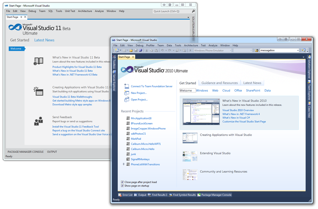
It's dramatic. It's initially gray. There is a light theme and a dark theme. Here's the VS11 next to VS10. It's still Visual Studio, so that's something, but the skin has changed.
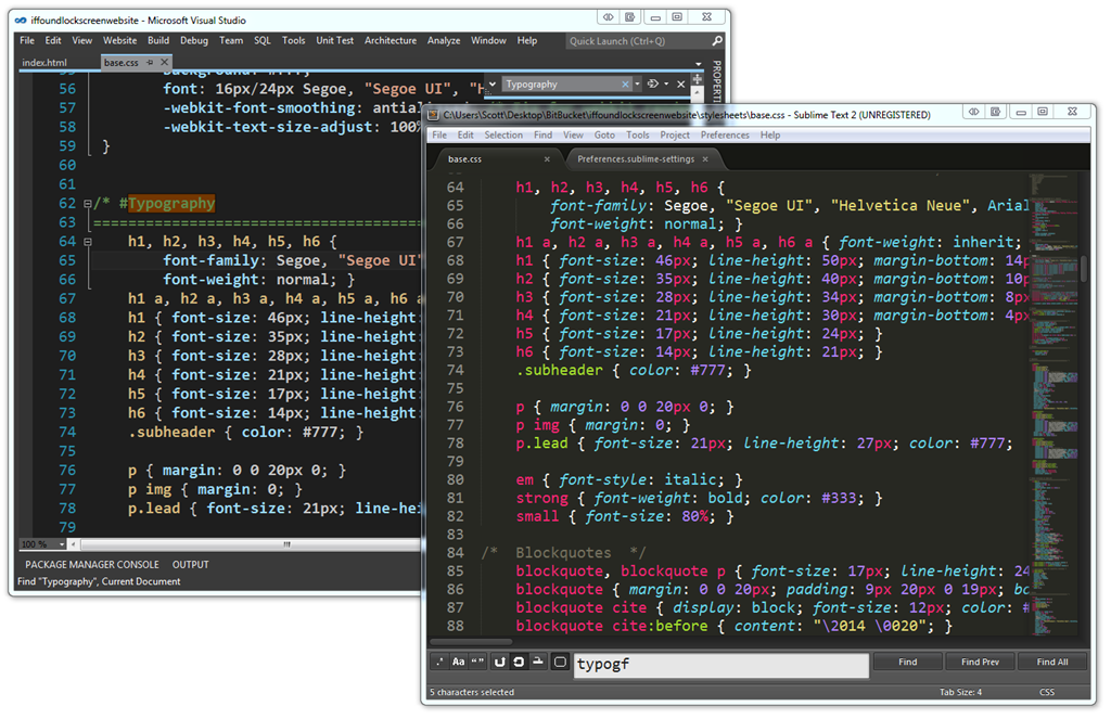
The dark theme in Visual Studio 11 looks a lot like my current Text Editor of Choice (and the new hotness everyone is talking about) Sublime Text 2. Here are the two side by side. They are pretty similar. There's only so many ways you can make a minimal UI with a text editor, line numbers, a find dialog and a scrollbar. I actually blogged about simplifying your Visual Studio 2010 a while back. Just turn the toolbars off. You don't need them. In fact, the Web Team (the team I'm on) has a simplified Code View that we've had available since VS 2010.
See how Visual Studio looks very different below than it does above? It's customizable so you can get a number of weird looks. I also blogged about how to change your themes and make VS 2010 look like 2008 here. Also, did you know about http://studiostyl.es? It's a growing list of themes for Visual Studio. There's hundreds. I called some out in my Visual Studio Programmer Theme Gallery.
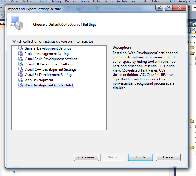
In VS10, today, you can switch your IDE to Web Development (Code Only) from Tools | Export Settings | Reset and you'll get this dialog. That will hide all your tools windows, and extra stuff in the Visual Studio you already have. This feature has been there for years because folks asked for it. This is the same list that you are offered the very first time you launch Visual Studio. It's a nice way to "tidy up" Visual Studio today. Of course you can change the colors and generally mess about as you like.
Here's VS11 and VS10 next to each other. VS11 shows a preview of images if you hover over it.
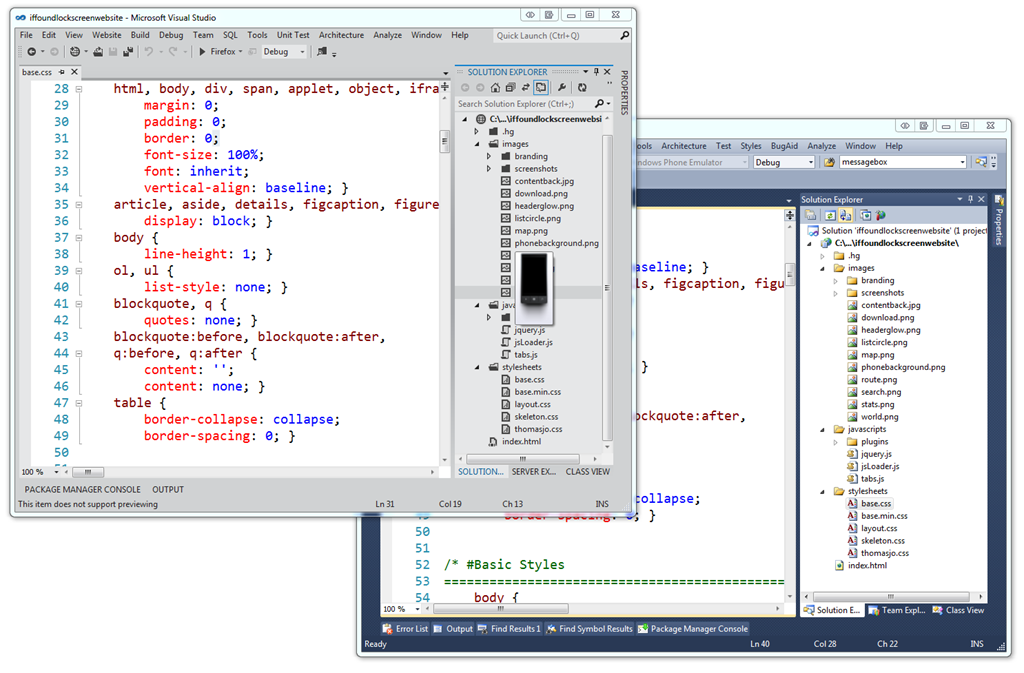
Personally, I don't like the ALL CAPS much. I'm sure they have heard that feedback from a lot of people. That's just one man's opinion but I'm not too worried about it. I know the Visual Studio design team is collecting everyone's on their blog and I encourage you to comment there so they see it.
The colorful Visual Studio icons were changed to glyphs. Glyphs are apparently a designer term for icons that are not colorful. You can see a lot of glyphs at http://thenounproject.com and I used a lot in my recent Windows Phone 7 application. We're used to seeing glyphs in Windows already, like in the "tray" by the clock. (Yes I know it's not called The Tray.)
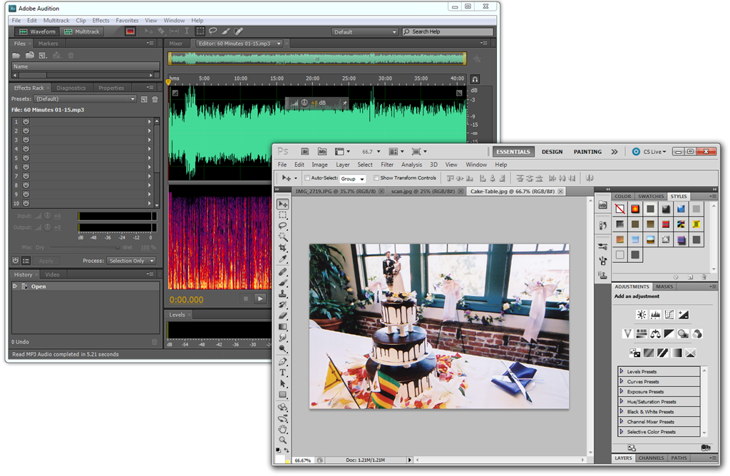
I'd like a little color in my icons, but I don't think they all need to be full color. Just include a splash so I can tell them apart. For example, here's my copy of Adobe Audition next to Photoshop, both from my same machine. Notice that there's some color in important buttons in Audition and very very minimal color in Photoshop, but mostly grays. There's still room for splashes of color in black and white glyph style icons. The idea is to make the icon get out of the way, but also be "scannable" so that I can remember not only where it is, but if it moves still scan and get to it quickly.
In Photoshop I'm editing color photos and in Audition I'm editing a colorful waveform. In both editors the UI is getting out of the way of the thing I'm editing. I like the idea of my editor being less important than the thing I'm editing.
New Features
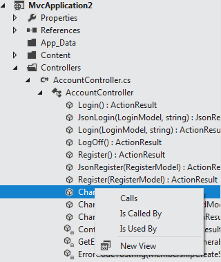
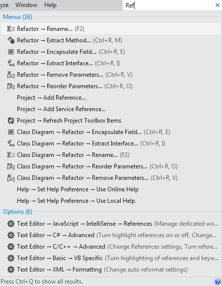 There are a pile of non-UI/UX features in Visual Studio 11 that are broad and systemic changes that aren't just changing colors. I’m finding it easier to locate the commands and options I need due to the new search features and toolbar reductions I mentioned above. I find myself exploring relationships in my code with the new Solution Explorer without having to switch tool windows like I use to. I also find that unlike in the past when the files I needed to focus on kept getting crowded out by lots of open stuff I didn’t need now I keep looking up at my open tabs and seeing only the stuff I care about. It's hard to express this without spending hours inside the IDE. There's bug fixes, speed fixes and memory fixes.
Non-theme-related work that the UX guys are doing cleans up the UI and improve it's functionality without removing features. When you consider only the more commonly used toolbars (Standard, Debug, Text Editor, Work Item Tracking, Test Tools), they've removed 60% of the clutter and globally there's 35% fewer commands in the toolbar in VS11, but all the features are still available. The stuff that has value is up front and easier to find and the obscure stuff I can search for with one hotkey. Don't let talk of icon colors (or lack of) detract from actual thought that's been put into a developer's (in my case, a web developer's) daily workflow.
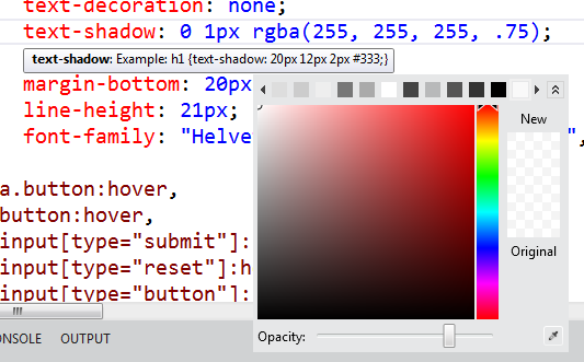
My team (the angle brackets folks) has talked about the features and fixes in ASP.NET, IIS and related tech on videos and tutorials up on http://asp.net/vnext and will keep updating that mini-site. All the editors have been updated with features like goto definition in JavaScript, color pictures and vendor prefixes and piles more. All added features, but done in a clean way that gives you useful functionality without adding more windows and widgets.
You'll get your hands on the Beta very soon. It's not too late to get or give feedback. All the teams are listening and I'm making sure that your voice (and mine) are going to the right people. To dismiss all the CLR work, the BCL work, the speed and meory footprint work over some icons is premature. Does it work?
Is this Metro-style?
As far as the design, I think that there's a lot more interesting work going on in Windows application design now in everyone's applications. No, not everything is or has to be "Metro-style." It does need to be thoughtfully designed, though. We've seen that in phones and on desktops. We're starting to see applications with design at their heart.
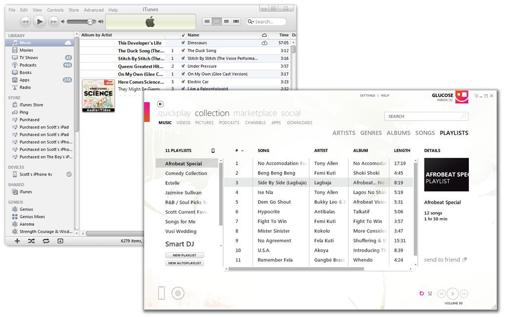
 I'm enjoying seeing what's coming next. There's a lot of interesting conversations around the web right now about what all design thought means for Windows, for Office, and for applications in general. Ars Technica has an interesting blurb that talks about an "elegant fusion of ribbon and Metro."
Is Visual Studio a metro-style application now? No. Is Zune or Sublime or iTunes or Photoshop? Of course not. I think the larger more interesting discussion is an increased use of whitespace, of design languages, of "content over chrome," of fewer lines, fewer wasted pixels and clearer spaces, of form meeting function. For now, Visual Studio is Beta, and it will look likely different when it's released. But it is being designed.
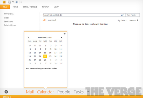
The Verge has some screenshots of some early builds of Office 15 and how it might look. I like our they to use color purposefully within the design. It's early to pass judgment on any of these applications, but I think I understand what all these designers are trying to accomplish. They don't (and I don't) want color and bling and flash in the outside application chrome if it doesn't provide information about my content. It's like what Tufte says, make those pixels work for you. Sure, one can blindly "Metro-style all things" but I would rather think of it as a applying design principles like clean lines, appropriate use of whitespace and focus on the the content (in this case, code). This beta is a step in that direction. I'm sure it will improve as feedback comes in.
VS and Me
There's style and there's functionality. So far I've been very happy with the functionality of VS11 and have been writing all my code in it. It opens VS2010 projects without converting and I can round-trip between VS11 and VS10SP1. I can create and target .NET 4.5 apps as well as.NET 2.0 apps. So far VS11 has been faster on my machines than VS10, and since I have more than one processor, I get multi-processor builds automatically. The editor is fast and the builds are fast.
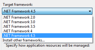
It's far too early to panic. Sure, my cheese has been moved, but I can always change the colors or toolbars. I just want a faster, cleaner, more productive system that focuses on the code.
My advice to you? Go follow the updates on the Visual Studio blog. Keep adding your comments, and check out their new Visual Studio posts each day including the one they just posted today about the Solution Explorer hub. But above all, download it on launch day, use it for a while and see what you think.
About Scott
Scott Hanselman is a former professor, former Chief Architect in finance, now speaker, consultant, father, diabetic, and Microsoft employee. He is a failed stand-up comic, a cornrower, and a book author.
About Newsletter
1. Many of the glyphs are larger (have more detail in the fact that there are more pixels for detail) to support touch.
2. There are fewer of them. They are more distinguishable because you don't have to compare very many to find the one you want.
In a toolbar, or a Solution Explorer, this is a horrible concept to introduce. You have much smaller glyphs, so shapes don't convey nearly as much information. Secondly, you have many, many more glyphs, and so you have to look at them longer to find the ones you want.
This is more than simply "who moved my cheese". This is making the screen harder to SCAN, and quickly find the command you desire.
In the dark theme those icons should invert just like they do on Windows Phone when you switch theme. They should not get some kind of bizarre jagged outline.
[)amien
The main problem, in my opinion, is that by removing the icons in the Solution Explorer it now takes more time, significantly more, to scan the files in the solution. Right now I know that C# files are "greenish", JS files are yellow, CSS are red etc. I know the actual file name is black, but that little bit of color helps in eliminating a huge group of files. In the demoed UI is hard(er) to tell what's a C# file, JS, or even a folder. You have to pause and really look.
Second, while the intent was to "clean" the UI they introduced extra distractions like ::: UPPER CASE HEADERS ::::::::::::. I would also argue that another distraction is the fact that there's very little contrast between parts of the UI, so it's slower to make out the delineation lines. For example the SE's top part is "bleeding" into the area around it, or at the bottom of SE the tabs bleed into the footer. Our eyes and brains are trained to look for borders / separations between objects.
The comparison between Photoshop and VS is not exactly apples-to-apples. The reason PS has to be dimmed down is because the way you "evaluate" the content happens at a more subconscious / artistic level, so the tool should not influence that. With VS we don't judge the code on its looks (in the sense of a painting). The fight is against complexity; hence the need to quickly find what we're looking for.
Seem to me they tried so hard to make it less distracting that they pretty much decided to turn off the lights, and now we're complaining that we can't find where things are.
Agreed. But the Visual Studio rework, for all the lip service, accomplishes exactly none of that. Well, okay, maybe 'fewer lines.' But it is still noisy, still cluttered. It doesn't use whitespace; it just removes separators. It doesn't put 'content over chrome'; it just makes the chrome harder to skim-read. Look at the Solution Explorer. It has *four lots* of noise (title, tool window control buttons, own toolbar, search bar) before you get to the content. And it's all jammed together. Where's the 'content over chrome'? Where's the 'use of whitespace'?
I would *love* to see Visual Studio "being designed," the eye of a great graphic designer brought to bear. But don't let's pretend that's how the VS11 beta visuals came about. From a visual point of view, this is still the VS2010 UI in all but colour.
That said, I do agree that it's not all about the visuals: things like command search and performance improvements are going to be very important. But if you don't want these to be overshadowed by the visuals, then fix the visuals -- and please, please, don't try to justify them in terms that they clearly don't live up to.
Well said Ivan. I absolutely agree.
Which is exactly why we need to voice our opinion now. Are we supposed to wait until RTM to explain why we don't like it, when nothing can be done? The VS team laid out their goal for the new design. We have a responsibility to tell them, NOW, that the design does not achieve their goals, while there is still time to change course.
I realise there is still time to give feedback, and I've done so and will continue to do so once I get my hands on the actual beta. My comment was intended to be about the mismatch between the stated principles of the redesign and its actual execution, and I don't think the fact that this is beta makes that mismatch any less.
If there were any indication from the VS team that the beta visuals reflected only the beginning of the design changes, then sure, it would be unfair to comment on that mismatch. But that's not the way Monty presents it. He seems to actually believe these visuals live up to the stated design principles. And going by the VS2010 beta cycle, I'd be surprised if the team were still planning substantial changes to bring the actual design more into line with the stated principles. It's too late in the product cycle for that.
Every version of VS I've used in the last 10+ has gotten better and better with each version. I don't expect this to be any different.
The best thing that MS can do is create a minimalist visual studio that runs fast and moves away from the underlining com objects. I don't need eye candy in my development environment. Also let's not muck with the keyboard shortcuts.
Maybe the whole "Metro" thing looks great on a low resolution phone or tablet, but I paid for all these pixels on my monitor and I'd like to get my money out of them.
I am a bit confused about .NET 4.5 installation today.
- I thought that .NET 4.5 will be installed on top of .NET 4. Am I right? So there is no side by side development with .NET 4 anymore. But it's not how it is being installed today. I'm assuming the reason why this is like that is that it is not the RTM. Right?
- I have installed vs11 preview on a Windows Server 2008 R2 (not a production one) but it didn't install .NET 4.5 on IIS. Should I do it myself manually?
My essential question is this:
what will be the final version install like both on the server and development environment.
Thanks!
I really like the new dark theme, it will definitely replace my Son of Obsidian theme.
http://visualstudio.uservoice.com/forums/121579-visual-studio/suggestions/2623017-add-some-color-to-visual-studio-11-beta
I also love new and "shiny" probably more than average people do, even if it's not shiny at all, new contains all the shiny I need.
But, Windows 7 started such a good direction in design, I really loved, an do love, the art direction and style, and now Microsoft comes to say that monochrome glyphs and rectangles is the new UI paradigm. Really? I really can't help to feel sad about it, because it feels like going backwards. (I'm not an Apple fan not even the slightest bit).
Focus on content is good, but I dare to say presentation is even more important, if it's the kind of presentation that manages to don't take away focus from content but instead add style and elegance to it.
What metro, although functional and with it's goals achieved, managed to do is to take away style and elegance from content. Focusing on content is a really good goal but the way it was achieved seems really.
Is this the new Microsoft way? Design through removing all design?
The color picker fully support HSB, RGB and hex. You can change the default in Tools/Options if you prefer HSB or RGB over hex
2. You find colorful icons in Solution Explorer distracting? You can (auto)hide Solution Explorer and other windows.
3. You find colorful icons in toolbars distracting? Just close toolbars and use main menu instead.
4. You want code to be more in your face? Use full screen view.
5. I never heard anyone complaining about UI in VS 2010, quite the opposite.
This new design was so uncalled for.
I won't even go into talking what is wrong with this new design, too much.. :-)
I am betting that Microsoft dumped a large amount of $$$ in this design and doing user studies, etc.
Yeah, they did study with all 76 people. That's right, 76 people study (icon study) for this complete and radical change of UI on such an important product.
Don't believe me? See VS team blog, it's all there: and all 76 of them agreed these new monochrome icons (glyphs) are better LOL
One has to wonder why, how is it possible, just look at all the negative comments there.. (I honestly don't believe they did any studies at all.)
I think we all know why: everybody clap your hands..
:(
On the other hand, now we have new VS Achievement unlocked: ":::VS11 BETA::: - Design Is Epic Fail." :-)
Scott, does this imply that Visual Studio 2010 was NOT thoughtfully designed? People like John want us to believe that if we dislike what Microsoft is doing, we should assume that it is we who are wrong, because Microsoft of course has conducted studies. The ridiculousness of that idea (and the fact that the only study quoted in the blog post involved a grand total of 76 people) aside - did no one do usability studies on Visual Studio 2010? Was time, thought, and money not put into its design? Visual Studio 2010 dramatically increased the use of color, as well as color variation (such as gradients), in the UI. Presumably that was done intentionally, with a good reason in mind. While there were some people who were opposed to the increased use of gradients, and the purple theme, I remember the overall response being positive (feel free to correct me if I am wrong about that). And of course they performed studies on it. What has changed so dramatically in two years that color in the IDE is now to be eradicated, where before it was to be emphasized? And if in fact eradicating color is the right thing to do, should we not now be outraged that Visual Studio 2010 actually decreased our productivity through the expanded use of color?
I realize you are not on the Visual Studio team, and cannot realistically answer these questions directly (although if you were inclined to put the legendary Hanselman investigative technique to work in this area, I am sure there are a great many developers who would be interested in your findings). But I am trying to understand the attitude of "put you own opinions aside and trust the Visual Studio team, they know what they are doing," because beyond being insulting, it doesn't make any logical sense to me. The last two versions of Visual Studio would suggest that in fact they have no idea what they're doing, at least in the area of style.
Dee - Your comments and thoughts are appreciated. However, I do know that they do do actual studies in the UX group and lots of them. You have a right to be frustrated but I don't think it's fair to imply anyone is lying about doing research. I'll see if we can get more details (as David points out) about what kinds of studies and how they go about it.
David - I didn't imply VS wasn't thoughtfully designed. I was pointing out that it's not Metro-style. I'll investigate some. I'm also not saying to blindly trust anyone. What I am saying is basic, and my opinion: It's a beta, they've got some new ideas around design, I'd like to know more about their thinking, and it's early to freak out about colors when I (and my team) are 100% focused on functionality. I'm following this UI thing with interest, but after using the IDE for a month, it hasn't slowed me down any more than the other apps I used as examples in the post. I'll continue to encourage the VS team to blog their thoughts and background info.
Everyone, please continue to keep the comments civil. I appreciate it.
The issues you raise with design are not just a Visual Studio issue but perhaps a Metro design problem. I like aspects of Metro but i feel sometimes they go to far and end up making it hard to identify different elements. Windows Phone is a good example of this. You have this common theme colour that multiple apps/functionality share. Until you get used to the positioning of icons/features in a list you mindlessly flip up and down the list until your brain kicks in and tries to figure out what the differences, and with metro there are not many differences. This same issue i feel impacts the decision people make weather they like or want to but the phone. The first impact is incredibly important and is normally decided within the first 30secs. How often did you want to by something because it looked awesome
At the very least it will halt me at VS 2010, Windows 7 and Office 14. I will go no further. When I cant possibly get the performance or support with those products, then its off to Apple land for me.
I cant stand metro. Its absurd looking.
I did initially hate the new UI but mostly it is starting to grow on me, the only remaining issues I have are what you've said: no screaming caps and it does need just a bit more colour to easily differentiate things.
1. I want to hear about REAL VS 2011 features like are they getting rid of the old Solution File format in favor of the MsBuild format to make it easier to use with TFS and customize.
2. How is it going to make it easier for me to build REST Services?
3. What have they added to make creating EF 4.5 projects easier?
4. Are they going to include the Oracle EF drivers in the install since the older drivers are to be removed.
These are the type of things I'm worried about. I'm sure they got rid of all the flash and glitz because it was causing VS 2010 to perform like a pig. Do I think they went too far, could be, but I will adjust since I really don't use the toolbars all that much.
Color brings extra information well beyond gray and who wants a gray boring world? Live in England so gray and overcast is our weather!
Using the name Adobe and good UI design in the same sentence invalidates any credibility!
For me I don't need new features etc, just something that works and doesn't crash at the wrong moment as VS2010 does. So bad that have droped back to VS2008!
Any chance of an article detailing how to port macros that use DTE over to the appropriate extension technology?
This. Also, since when is Metro about less wasted pixels? Those ginormously obnoxious typefaces are anything by that.
My conspiracy theory is that MS was trying to trim down its graphics staff so they made Metro which is all typeface and monochrome simplistic icons, which anybody can do.
This weekend I took the deep dive and pulled down the Beta bits on my main dev environment thinking I was gonna be cool and do all my dev work on the bleeding edge. My colleagues on the vs team promise this is perfectly safe and I know they are good people who have only the best intentions for me and my code.
Well 2 days later, I'll admit I have spent several hours figuring out why my .net 4.5 compiled code acts like it has special needs on a 4.0 environment. I'll admit that it ends up that most of these problems are due to the fact that I ilMerge some of my assemblies which according to the ilMerge creator is not a surprise. I hope to get past all this soon and resume day to day development on VS11.
I just mention all of this as a cautionary note to anyone planning on using the beta bits to produce production assemblies that may be run on .net 4.0 machines without 4.5. I'm sure this all goes without saying but please make sure to test your code on 4.0 environments before releasing anything.
That's the importance of color when shapes are small.
And I take on borad your comment about MS not reading comments here. I tried to submit my feedback on that blog post and it consistently failed. I retyped it the next day on Chrome, and it worked. That's one hell of a fail. And why will they not see feedback here? They talk about the community, so they should at least read here - though not necessarily comment.
(after removing all the f words)
"Holy [], those [] are just imitating itunes and apple crap AGAIN."
This is just asking apple to sue MS for copying color schemes.
I usually never bash MS just for the trend. I love MS. But lately, they are just lining up with all the other apple copycats... What a horror show...
Metro is ugly. I want SPEED and efficiency. Click VS, 1 second later it's ready to load a project. You have not comented on the performance of VS11. Is it still FAST to open and load projects, or does it need 10 seconds to preload all images, the UI, etc..?
Matt - Thanks!
The hundreds of negative comments the new design has received are warranted IMHO. The new look should have been an optional theme from the beginning. Part of the outrage is that the VS team proudly announced the new design as an improvement in usability when it actually has the opposite effect (as many have pointed out).
I'm a C++ developer, and I've been perfectly happy with all version of Visual Studio from 1996 till 2010, (love F# features and the new C++ auto, and lambda expressions). Though for me, I find that the new interface very hard on the eyes out of the box. Like I said that there is no color or boundaries to guide the eyes with what is happening on the screen.
I would of been more happier, if the old standard look and feel was kept and all the improvements in intellisense, code complete, speed was moved over to a 2010 theme.
Though thankfully, it does not use the new office ribbion UI.
Please, bring them back, with 3x's the programmers.....well, I and a lot of others miss them.
Do you know of a tutorial that would help?
http://visualstudiomagazine.com/articles/2012/05/08/color-returns-to-visual-studio-11-user-interface.aspx
The community seems to be unanimous on this, so I really wonder how it is that the VS design team was themselves so asleep.
Comments are closed.

It's basically team's fault out of the all new features/improves they decided to blog about redesign first (and only about it). Like developers care about the look and feel first (I'm not talking about the apps they create, but about IDE they use). I'd love to hear about speed improvements (especially when working with TFS configured as source control), lower memory usage, extensibility and all those other things that are of the biggest importance for a developer. As you've mentioned - everything can be customized, but I really hope professional developers already knew that.
Yet, the team decided to blog first and blog only about the design 'improvements', so the criticism, I think is very well deserved. They should have remembered about their audience.