Scott Hanselman

In search of the perfect monospaced programmers font - Inconsolata

November 26, 2006 Comment on this post [35] Posted in Tools
Sponsored By

I'm always looking for a good monospaced programmers font. There's lots out there to choose from. Some strongly prefer bitmapped fonts with no hinting. Personally I REALLY prefer heavy antialiasing with the a smooth, almost blurry (not pixelly) feel. Here's some I've used, but I'm currently leaning away from my previous favorite, Consolas, and using Inconsolata that Tomas turned me on to.

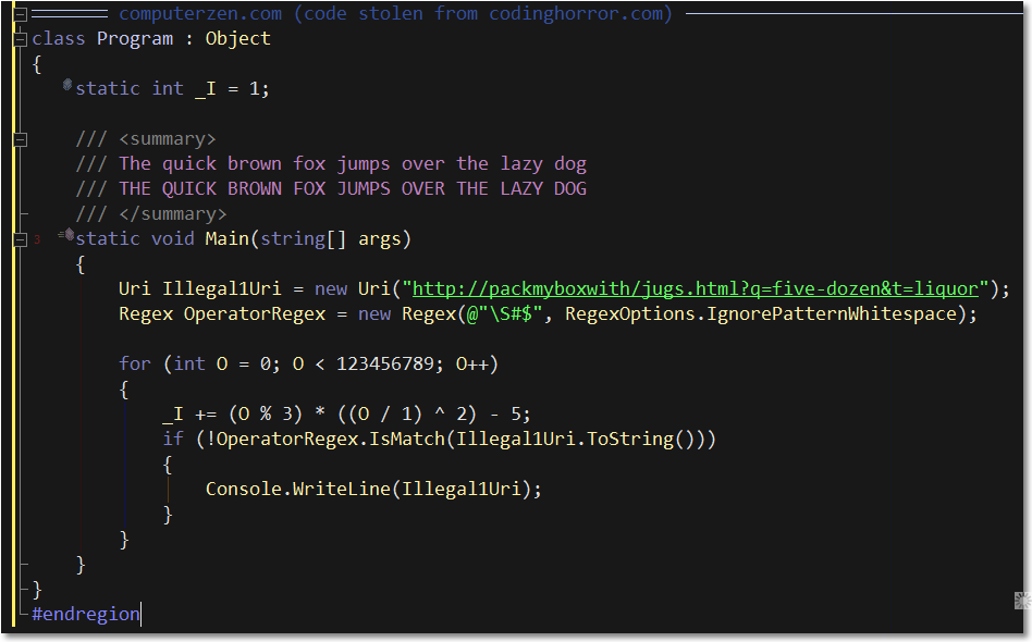
I think (hope) we can all agree that Courier New isn't where it's at. And yes, I run at 14 or 15 point all the time.

(I realize that these are huge in width and that they will goof up my site's horizontal scroll bar for a week or so, forgive me, they looked lousy when thumbnailed.)


Inconsolata - my current monospaced font, and the most Mac-like you can get on Windows (including Monaco, IMHO)
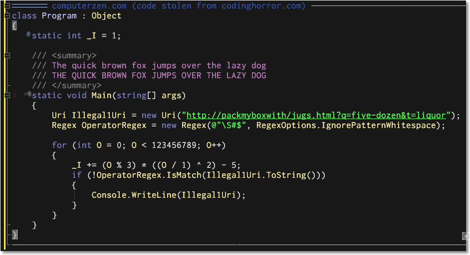


Courier New


Bitstream Vera Sans Mono


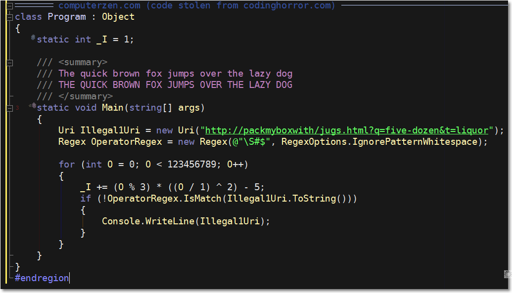
Consolas (included with Vista and Office 2007)

About Scott

Scott Hanselman is a former professor, former Chief Architect in finance, now speaker, consultant, father, diabetic, and Microsoft employee. He is a failed stand-up comic, a cornrower, and a book author.

facebook twitter subscribe
About   Newsletter
Hosting By
Hosted in an Azure App Service
November 26, 2006 11:52
I have never liked Vera Sans Mono, and of course Courier New is awful. I like Inconsolata, but I think you might be looking for something bolder.. have you tried Consolas with Bold enabled?
November 26, 2006 12:53
Ditto on Jeff's comment - it simply looks like a bold Consolas...on my machine, Consolas looks like your screenshot of Inconsolata, with the way I tune ClearType...the difference seems so subtle...
November 26, 2006 14:29
Are you using a black editor background all the time? Does it have advantages for your eyes?
November 26, 2006 14:38
This one looks nice, but it's pricey.

http://www.fsd.it/fonts/pragma.htm
November 26, 2006 16:12
Hi Scott, thanks for the pointer. Sorry for the silly question, but how do I get it installed on my machine? On the page of the author I see it's available as .sfd, .otf and .pfa, I haven't tried yet but I wonder if windows recognizes those formats.
November 26, 2006 16:15
Windows supports Open Type Fonts, so just drag it to your c:\windows\fonts folder.

I think it looks VERY different from Bold Consolas...
November 26, 2006 16:37
Isn't this great when we can put aside all the technical problems of the day and just debate what fonts we use.
November 26, 2006 17:33
I'm rather enjoying Inconsolata myself, and I'd agree with Scott that it is different from Consolas (even in Bold). While there is some similarity, it just has a distinct feeling about it.
November 26, 2006 20:22
Hi Scott, would it be possible to get an export on that theme?
November 26, 2006 20:48
This looks really good, too bad the zero and the letter O are so similar -- that's a deal-killer for me.
November 26, 2006 20:58
Sorry but I don't agree this is any better than Consolas. The only thing that would keep me from leaving Consolas for this, the slashed zero. In your example I can't tell the difference between 0 and O other than colour (which is no good for me since I don't see any) and size (which is no good because they're too close together and unless they're side by side in code, I wouldn't be able to tell the diff).
November 27, 2006 0:28
I agree with Jeffrey, the zero and the letter O is to similar. I will keep the Dina programming font for now.

@Johan
Here's a dark scheme: http://weblogs.asp.net/infinitiesloop/archive/2006/08/06/Join-the-Dark-Side-of-Visual-Studio.aspx
I'm not sure its the exact same theme Scott is running.

November 27, 2006 3:52
hello Scott Hanselman,
May be you can share settings (colors) for this black theme for VS which you are using atm? ;) its looks cool and i wanna try black them like this.
Thnx :)
IPY
November 27, 2006 6:04
I think this post covers the color settings.

http://www.hanselman.com/blog/ChangingYourColorsInVisualStudioNETBlackVersusWhite.aspx
November 27, 2006 8:49
I think your consolas picture is wrong. As noted above, a consolas zero has a slash through it, but your Consolas picture does not.
November 27, 2006 16:57
My name is Hadi Ismanto. In the screenshot, it seems like there is a vertical blue thin line between the beginning brace and the end brace of the for loop as well as the if condition statement. Could you let me which setting should i configure in my VS ?

Another question, is there a dark setting environment for Eclipse and NetBeans?

Thanks in advance.

November 27, 2006 17:59
Hadi: Those lines are a feature from an addin called Coderush from Developers Express.
November 27, 2006 18:26
I'd love to see a shot of how verdana stacks up to that lot. It's my choice of font in VS, so much more readable than a monospaced font. How often do you really line things up in columns anyway?
sk
November 27, 2006 19:56
But the real question is.... Why use a mono-spaced font at all? I prefer a variable-spaced font (specifically, Comic Sans MS)
I've created samples (using the same code & colors of Scott's) in 10pt (my usual)

http://honestillusion.com/photos/blog_0/images/4022/original.aspx

and 13pt (as close to Scott's 15pt that I can stand)

http://honestillusion.com/photos/blog_0/images/4023/original.aspx

You'll note that alignment is not a problem, if you uses tabs, as the Good Lord intended.
November 27, 2006 21:20
To me the Courier New looks the closest to what I currently use, but I have my text size a lot smaller then most people probably do. I am a huge fan of Arial size 10 or size 12.
November 27, 2006 21:25
@James: Comic Sans MS? ouch! I would've forgiven verdana or tahoma, but CSMS? no way :)
And to add insult to injury, tabs instead of spaces! Ohh, the heressy! :)
November 27, 2006 21:26
ProFont is still my favorite programming font. The bigger curly braces and punctuation really make it for me.
November 27, 2006 21:50
I have been user Vera Sans Mono for a while now and it like it a lot.
It is a nice fixed width font.
Characters O0(zero and oh), l1( El and one) and (){}[] are all easy to tell apart.
Also it support italics which Consolas had a problem with on my machine.

November 28, 2006 3:06
FWIW, I went through the agony (minor, really) of installing Cygwin and FontForge for the sole purpose of editing the 0 (zero) to have a dot in it. With that change, Inconsolata is pretty decent, especially at sizes greater than 10pt.
November 28, 2006 12:04
Hi all, and thanks for enjoying the font I created! The slashed zero is by far the single most common request, so I'll be making that available as an option.

I started out making the font for print use only, not trying to optimize it for the screen. So at these large sizes (and as display resolutions go up), I think it is affected by the compromises needed for inadequate numbers of pixels. At small sizes, a bitmap font is going to be crisper.

Please send me your feedback if you have any ideas on how to make the font better. It's just on the verge of official release, so there's still time to get some tweaks in.

I've got both programming and printer's ink in my blood, so I tried to pay special attention to getting the ASCII characters tuned just right for code. Let me point out some of the subtle things I did:

1. [] slightly smaller than (), because in C-family languages they usually nest inside. That's true for the Main decl above, and I think it helps.

2. Big {} with strong visual distinction between left and right facing. The Courier New really suffers on this one.

3. +-*= harmonize and center in the same place in the cell, as befits their role in C. Notice in particular how += retains its vertical symmetry. The same is true for arrows like -> and =>.

4. Clear separation between top and dot of !, so it can't possibily be confused with a vertical bar. I find that to be a flaw in Consolas.

So, please, enjoy. Also, I'm really looking forward to seeing this font in print. There are some details in the curves that don't really come out at screen resolution. Not to mention, most of the monospaced fonts I've seen in print are bad to truly awful. So, for those of you out there working on books, recommend this to your publisher!
November 28, 2006 20:52
Oh dear, I'm still using Courier New @ 10. I'm amazed to see screenshots with the point size so big... half my code disappears off the right-hand side of the screen when I try that. And I don't want to have to scroll horizontally all the time just to read some code. I have a 17" flat-screen, @ 1280 x 1024 (96 DPI). Do you guys who use 15 point have much larger/wider monitors?
November 28, 2006 20:57
The thing I can't figure out is how he got Program to be a different color from all the other types (Uri, Regex etc)
November 29, 2006 1:21
Inconsolata looks quite horrible on a white background though. Almost made me believe something was wrong with my eyes :). The "blurry" effect (?) is bearable only on a black background.
November 29, 2006 1:53
@Andrew: My laptop does 1920x1200, so 10pt fonts really aren't very readable at that size :) Besides, I usually try to keep my lines on the short size (as much as possible).
November 29, 2006 2:59
@Tomas: thanks for this. Yes, I'll deffo go for a larger screen + higher resolution when I get my Vista + Office 2007 machine next year.

For now I've changed the habit of many years and changed my VS settings to:-
1) Zenburn ("exported-font-and-colors-zenburn.vssettings" - linked found on CodingHorror site);
2) Courier New @ 12 instead of Consolas;
3) This sends text off the right-hand side of the VS05 editor, so I now shift+alt+enter to go into full screen to edit code.

This works very well. I'll change to Consolas @ 15 (or thereabouts) when I'm running Vista and also have a larger screen size. Switching ClearType on in Windows XP makes Consolas look great in VS05, but all other fonts (e.g. in Windows Explorer) look terrible. Roll on Vista!

BTW: reading this blog entry has changed my life (and saved my eyes? ...possibly!). I can't wait to share this with the guys at work tomorrow.

Cheers.
November 29, 2006 3:06
Forgot to say:- I modified the Zenburn VS settings (after importing) so that all UserTypes are coloured as RGB = 226, 197, 107. This helps differentiate them better.
November 29, 2006 3:51
I've put a modified version of Inconsolata up at my blog which features a crossed zero and a slightly modified lower-case f to reduce some of the blurring although really I think the font just needs hinting. Just a hack really until Raph gets his next version out although there are a few things I want to try with it :)

[)amien
December 01, 2006 2:31
Nice colour settings you have there, I know someone already asked, but could you share them?
The ones that you have listed in the previous post around black vs white backgrounds are not the same.
I tried for a couple of hours today to come up with the same colours; however mine still have too much contrast in them.
Thanks
December 01, 2006 23:44
I like the color scheme, but anybody know how to change the mouse cursor color? On the black background I can't see where the cursor is until I highlight stuff, which isn't exactly ideal; I guess I'm a bit of a newb but I still use the mouse inside the text editor a bit.
December 20, 2006 17:22
For those who like highly legible monospaced fonts with easily identifiable characters (the difference between O an 0 have been mentioned a couple of times), the font Andale Mono is a great option imho.

Comments are closed.

Disclaimer: The opinions expressed herein are my own personal opinions and do not represent my employer's view in any way.