Make your Website Mobile and iPhone Friendly - Add Home Screen iPhone Icons and Adjust the ViewPort
If you're noticing when looking at your blog traffic logs that more and more people are visiting your site from a mobile device, you likely want to be accommodating.
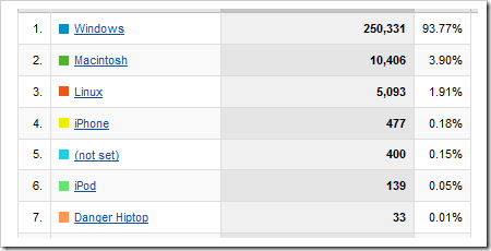
I have noticed recently that mobile devices like the iPhone, iPod Touch and Danger Hiptop (well, that's probably just one guy) have been creeping up my list of Browsers+OSs that visit this blog.
How can I make their experience suck less? Just because the iPhone has Safari and can handle most full-size doesn't mean I should go bonkers with the HTML. There's a few simple things that can be done to make the experience more seamless.
Add Home Screen iPhone Icons for your Website
If you visit a website on an iPhone and hit the plus button and click Add to Home Screen...
NOTE: Hold down HOME and the LOCK button to take iPhone screenshots.
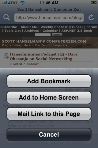
You'll get this screen with a generated thumbnail icon of the current browser's screen. In this case, it's way too tiny and doesn't really well represent my site. It's certainly not an icon that I'd want on an iPhone's Home Screen.
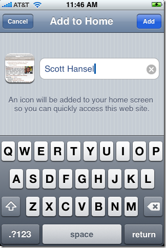
However, if you make a 60x60 PNG image file and name it "apple-touch-icon.png" and put it in the root of your website, you'll get control over that icon.
 If you don't have control over the root of your domain you can add a <link> to your pages and point it to whatever PNG you like wherever you like:
<link rel="apple-touch-icon" href="/customIcon.png"/>
Now, if you hit Add to Home Screen, you'll get a nice image with automatically rounded corners and a shiny bevel (the phone does that), your icon like this, will show up like this:
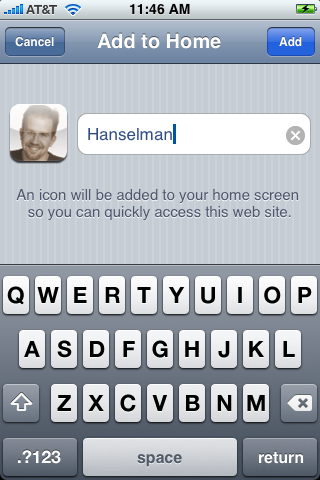
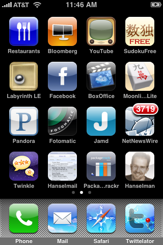
Very little effort for a considerable amount of polish.
Adjust the ViewPort for a "Pre-Zoomed" iPhone Experience
Next, if you visit a web page with Mobile Safari and you always double tap to select the content and zoom to the width of it, why not just set that as an initial default? Just add a <meta> tag like this:
<meta name="viewport" content="width=670, initial-scale=0.45, minimum-scale=0.45"/>
That will set the width of the "viewport" - the part of the page that is visible in the zoomed-in view - as well as the the initial zoom scale and minimum scale. This makes for a pre-zoomed and easily scrolled experience that doesn't change the way the page is laid out.

It's still the full content, just pre-zoomed for the iPhone.
Enabling All Mobile Devices
Next, to the mobile users who are not using an iPhone, about two years ago I added support to DasBlog for a custom Mobile Theme that would enable Windows Mobile and Blackberry Mobile Browser users to browse DasBlogs more comfortably. In the DasBlog web.config there is a huge section at the end that was populated from this CodeProject article on BrowserCaps. It uses the older ASP.NET 1.1 style of browser detection.
For example, if I wanted to serve a Mobile Theme to iPhone users that visit my blog, I could add these lines to the filter areas for platforms and OS's:
<case match="iPhone">
  platform="iPhone"
</case>
...snip...
<case match="iPhone">
  os="iPhone"
</case>
...snip...
<case match="iPhone" with="%{os}">
  isMobileDevice="true"
</case>
DasBlog then just checks like this and does the right thing. DasBlog uses its own theming engine, but you can use this kind of detection and "downgrade" your site for any device you like.
//Are we on a Mobile Device? See if we have a mobile theme and use it instead.
System.Web.Mobile.MobileCapabilities mobile = (System.Web.Mobile.MobileCapabilities)Request.Browser;
if(mobile.IsMobileDevice == true)
{
    theme = themes["mobile"];
    if(theme == null)
    {
        loggingService.AddEvent(new EventDataItem(EventCodes.Error,
            String.Format("If you have a theme called 'mobile' in your themes folder,
                readers who visit your site via a Mobile Device will automatically
                get that theme. User-Agent: {0}",Request.UserAgent),
            String.Empty));
    }
    else
    {
        return theme;
    }
}
Either way, if you choose to setup a custom Mobile theme for a visitor, or you just add a few bits of "chrome" like friendly icons and some browser specific metadata, it's important to at least be conscious of who is visiting your site in which devices and feel empowered to make good experiences for them.
About Scott
Scott Hanselman is a former professor, former Chief Architect in finance, now speaker, consultant, father, diabetic, and Microsoft employee. He is a failed stand-up comic, a cornrower, and a book author.
About Newsletter

 w2wlink Webmaster


Is there an iPhone "emulator" by chance to allow testing a given site in terms of how it will render on the device and to also test elements like the icon? Or is the only real way via hands on with a real iPhone or iTouch, I assume the iTouch would be identical in the browsing features to the iPhone would it not? I currently use a Nokia N800 for mobile browsing but for compatibility testing it would be nice to have some means to test the iPhone experience, due to the growing market share.


Mark - Apparently there's like a $99 SDK you can get for the iPhone but it only runs on a Mac. That said, I did it with the User Agent Switcher and FireFox.
Go to http://www.apple.com/developer
Scott, was just poking fun about the iPhone. Though I had heard some rumors back a couple of years ago that some of the people in the Windows Media group would tend to freak if they saw an iPod laying around.
I would like to note one other thing that I find weird, maybe you as well. As a consumer, I feel well taken care of by Apple. The interface is usually everything I want and more and the functionality is just forward-looking enough to keep me happy. Let's just say that's not what I get from MS.
As a developer, I feel well taken care of by Microsoft. The toolset is rich, the developer community robust, and the people from MS are open with where things are headed and are great at responding to issues from the field (particularly in the blog space). Let's just say that's not what I get from Apple.
Any thoughts?
I think you nailed the contrast. As a dev, I love MSFT, as a user I love Apple.
I thought you had taken the iPhone back? Must have changed your mind or got the 3G...
Thanks for these tips! I've have my iPhone for a year and didn't know about the screenshot trick.
I got the SDK and am just having fun learning ObjC/Cocoa. It's a trip!
I have to agree with you: dev -> MSFT, user -> Apple. I just wish I could meld the two easier and without a Parallels virtual!

The 4-5 hours on your new IPhone, is that with heavy use or is the battery really unsuable?
Cheers
Vishal

In any case with respect to the charge that the battery seems to be holding, it could be a bad charger. My iPhone had one out of the box that was bad. It would not charge the phone at all. The phone would charge from a computer via the USB connection cable. While that worked, it was an inferior quality of a charge. "Full" really only yielded a couple of hours without having to be charged again.
We determined that the wall adapter was bad by testing with my son's wall adapter and my phone. It charged just fine.
I took the adapter back to the Apple store at Pioneer Place (Portland, OR). At first they didn't believe me. But the person I talked to tried everything I did and did believe. They gave me a new power adapter. The iPhone now holds a charge for about 7 days of stand by (haven't actually clocked it, but it's somewhere in that neighborhood).
The person at the store strongly recommended always charging the iPhone from the power adapter rather than from the computer. They felt that the quality of the charge was better. In my experience, they were right.
@Scott -- If your iPhone isn't holding a charge long enough, it might be worthwhile to ask the Apple store to replace the powere adapter.

Comments are closed.