Sony: Anatomy of a good web interaction
 While I do dig Sony's hardware, my experience with their website and the company in general has been a giant, faceless, nameless automaton on another continent.
My wife has this Sony Clié "PalmPilot" from a million years ago that she totally relies on for her Address Book. She doesn't want me to buy her a new one because "this one works fine."
However, I upgraded her computer
(remember the Toshiba M200 I was trying to get to get Aero glass working on? That's hers now. It runs 1024x768 with Aero no problem, but I can't stand to look at it because the native resolution is 1400 by something. I don't know how you people can stand running an LCD at non-native resolution...)
to Vista a while back, but never installed the ancient Palm Desktop for Clié.
Sigh...I figure, off to the beast that is the Sony website. I mean, seriously, they have like 2000 different products...
(By the way, which of you Dear Readers, is going to sell me a Sony Aibo?)
...so at this point I'm not looking forward to hunting for five-year-old software on a giant corporate website.
In fact, I was wrong. The interaction was brilliant. Here's how it went down.
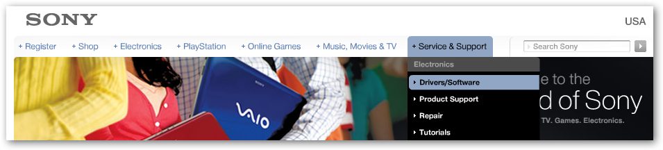
1. Visit Sony.com...click Service & Support, then Drivers/Software. They get an initial -1 for using Flash for the whole home page. Not because I have a problem with Flash (or Silverlight for that matter) but because of my initial knee jerk reaction of "Oh crap, another fancy Skip This flash movie to introduce me to a corporate website." No one likes that feeling. In fact, I was wrong. I assumed they were loading a movie/intro but instead they loaded a very functional menu.
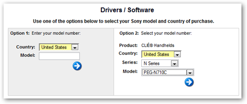
2. Next, I'm presented with this page. Not perfect, because the first reaction is to fill out both sides, but once I figured it out, I realized that I could either enter the Model Number or do the cascading menu thing. I really appreciate it when a company keeps the product menu complete and fresh. I was happy to see this old model still appearing in the menu.
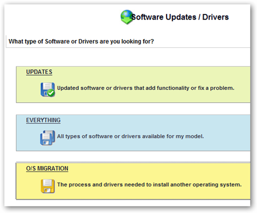
3. This next page is inspired. Again, no one is winning any design awards for these pages, but I'm talking about smooth interactions. Why is this inspired? One word: everything. This giant corporate behemoth actually gave me a menu item for "Everything." This is the user interface item that says, "get out of my way and just give me the whole list." Fabulous. Boo-ya. I literally muttered "sweet" under my breath when I hit this page.
4. Bam, there's my software, with a five-year-old date on it.
(What does that say about the Internet that I'm amazed to find something Five Years Old that is still cared about? Why is finding stuff that old in my garage a daily thing, but on the web it's a miracle?)
I download the software and I'm on my way.

Yes, I tried Googling for Palm Desktop Sony Clie N710c first, but didn't find anything promising (I'm lazy) in the first page so I ended up going to Sony.com and finding what I needed very fast.
It is probably possible to make this 4-step interaction more streamlined, but sometimes one-step isn't the right number of steps. In this case, there were no false starts, no ambiguous questions, no backing up or poking around. It was not only clear to me how to find what I wanted (remembering I had low expectations), but the interaction left me thinking ever-so-slightly better of Sony - a company whose website I'd largely mentally given up on.
Whose website has recently surprised or impressed you with a specific interaction or a recent redesign?
About Scott
Scott Hanselman is a former professor, former Chief Architect in finance, now speaker, consultant, father, diabetic, and Microsoft employee. He is a failed stand-up comic, a cornrower, and a book author.
About Newsletter


Nice one sony. I still wouldn't buy one of your products (for other reasons), but this is nice.

But mostly I'm PO'd by the whole Web 2.0 thing when it comes to driver/firmware/software download pages. I like to bookmark the device driver/firmware download pages for the hardware I own in a single bookmark folder, then "Open All in Tabs" lets me review the status of the driver releases fairly quickly and easily, EXCEPT for hardware vendors that think that a 6 step AJAX wizard is the best way for me to locate my drivers/firmware for my device (this would include Sony from your description of the Flash system used to guide you to the correct driver).
There are two solutions to this:
1) Vendors should provide RSS feeds which are reliable and accurate, describing when new versions of drivers/firmware/software have been released. Given the fact that some hardware vendors can't seem to even keep their driver download pages up-to-date, I don't hold out much hope for this.
2) Make driver/firmware/software pages bookmarkable (why does this even need to be explicitly stated?). I'll even accept abominations like
http://www-ca.linksys.com/servlet/Satellite?c=L_Download_C2&childpagename=CAen%2FLayout&cid=1153781261058&packedargs=sku%3D1153781417540&pagename=Linksys%2FCommon%2FVisitorWrapper&lid=6105812181B03
if it means I can bookmark and return to it in the future.
And this isn't even about my obsessive need to bookmark every download page I encounter. I've attempted to get people I support (my parents) to download something, but it is almost impossible when the instructions are a page long, consisting of "choose X, click Next, choose Y, click Next, choose Z, click Next".
In this regard, Google definitely has it right: desktop.google.com, earth.google.com, etc. Go there, click "Download". Done.

Comments are closed.
I guess that if sony's website was more accessible, you'd have a direct link to the download page from the first google results.
Anyway - at least it's easy enough to find it.
I'd note two other hardware manufacturers that I have recently went to their website for drivers/firmware, and was very easy to work with to that end:
Gigabyte (even though their homepage has a wacky name: http://tw.giga-byte.com/ )
NEC - it was so easy to download firmware and to the upgrade for my dvd/rw
on the other hand, Club-3d made it quite difficult to find an exact product details and download on their website