Take advantage of the extra resolution
A fellow mentioned to me today that the 1900x1280 resolution of his new laptop was getting to him and he was thinking of trading it back in for a laptop with a lower resolution.
When I hear folks say things like this, and lots do, I imagine them in front of the default Windows desktop with the unchanged tiny icons and tiny fonts. I'm surprised that in this time of XGA+ super-wide 16x9 laptops that Dell hasn't thought to click "Use Large Fonts" and make a few other small changes.
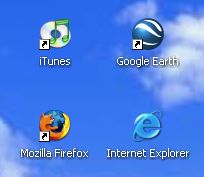
Here's a partial screen shot of my 1280x1024 desktop with standard fonts, icons and spacing. There's a lot of pixels there that are NOT working for me.
Before:
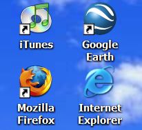
Now, here's the same area with Desktop|Properties|Effects|Use Large Icons checked and the default Icon font pumped up a bit. Also I turned on ClearType (and you should to, here, online [IE Only]) which still isn't turned on by default on most laptops.
After:
Amazingly, I've even seen folks running their IBM Thinkpad T42s at 1024x768 (on a LCD that supports 1400x1280) because the default settings suck.
I love using Ctrl-MouseWheelScroll and applications that support them. Try it sometime. Try it in Excel or Word or IE or FireFox or Notepad2. Get the VSZoom addin for Visual Studio to zoom in and out on text. Or, just switch to 14 point (instead of 8pt) everywhere and enjoy.
Now, if you are a small font person who loves the extra detail, more power to you. But if you want the kind of space that 1024x768 provides with MAXIMUM clarity, then run your LCD at its native resolution and adjust your fonts by 30% to 40% larger.
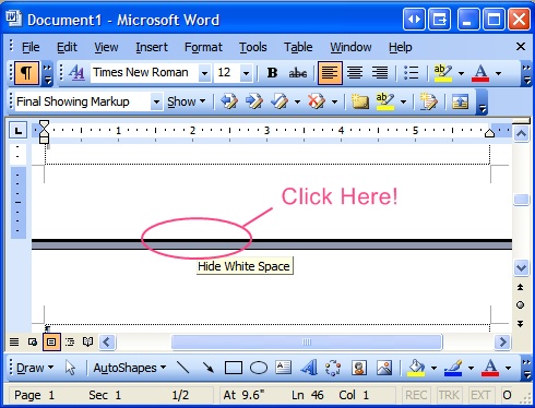
Scott's Final "Presenting with Word" Tip (If you remember one, remember this): If you are presenting a Word Document on a projector - and we all have at one point or the other - even in a small group, do this: Alt-V, then Z, T, Enter. For extra points, do Alt-V, then U for Full Screen. Then click in the gray space between pages to spare us all the bottom and top margins. Do it all in one smooth motion to impress.
Make the pixels work for you!
Now playing: Counting Crows - American Girls
About Scott
Scott Hanselman is a former professor, former Chief Architect in finance, now speaker, consultant, father, diabetic, and Microsoft employee. He is a failed stand-up comic, a cornrower, and a book author.
About Newsletter

 Ripster
I try to group my icons by category on desktop and hide inactvie icons. (anyway there are many active icons on my desktop!)
+ VSZoom is very useful specially for night coding!
http://blogs.msdn.com/oldnewthing/archive/2004/07/14/182971.aspx
and be sure to check out the interesting comments on this post.

I agree and understand that higher resolution should = higher clarity. I have played with a lot both the DPI, font and icon settings. Some applications look really good. Opera was a good suggestion. Doubling everything is great on the text side, but images get "pixelated". The web seems to be one media that just doesn't translate well right now with a high resolution display. I would be nice if browsers included a DPI setting within the useragent string so servers could render accordingly. Fonts with css settings of 11px might be roughly the same as 11pt at 96 DPI, but at 150 DPI, 11px is roughly 1/2 the size. Take a look at Newsgator at 150 DPI. Pretty illegible.
It would be nice if the task manager / task bar in XP rendered icons using the higher res that is available. My desktop and quick launch bar are able to and they look great!
I just haven't figured out if dealing with some of the issues is worth it right now. I feel like I am breaking new ground. Certainly a lot of people have been here before me. Sounds like a whole area that needs addressing. Maybe it is time for me to start a blog that addresses the issue?
Thanks again. Sorry for the the whining.
-Andrew

- David

Comments are closed.