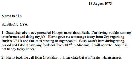
Forged Bush Memos - Someone used Word and had AutoCorrect turned on.
There's a lot of talk on the blogosphere today about the Bush Memos being forged. I looked at the memos (pdf) and it takes all of one minute to see that it's true. The kerning is obviously a Times New Roman class.
BIG UPDATE: Turns out they ARE fake. "The man who gave CBS News disputed documents describes how he obtained them; in television interview, he admits he deliberately misled a CBS News producer."
UPDATE: This from Little Green Footballs - an animated gif showing the Word version and the Memo itself.
This fellow OWNS one of the TypeWriters in question and says he doesn't buy it either. His site http://ibmcomposer.org/ is the only site dedicated to this typewriter.
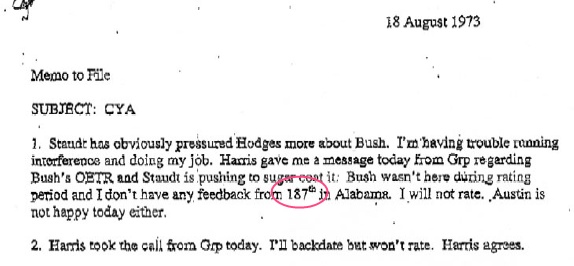
Chris Brooks, my boss, had the most damning comment: Look at the superscript for crying out loud. I gasped. It's the "autocorrect" feature in Word creating a "th" after a number. Oy. Someone needs to lose their job. It's a shame, as I liked Dan Rather.
Here's IBM Composser guy's thoughts on making a "th" in 1973:
A: Yes, but not in one keystroke. To type 111th, you would first type "111", then remove the 11pt font element, and replace it with an 8pt element, then change the escapement (horizontal spacing) to the narrowest setting, half reverse index the paper, type "th". Then, you have to reverse that process by half indexing the paper back down, replacing the 8pt font element with an 11pt font element,...
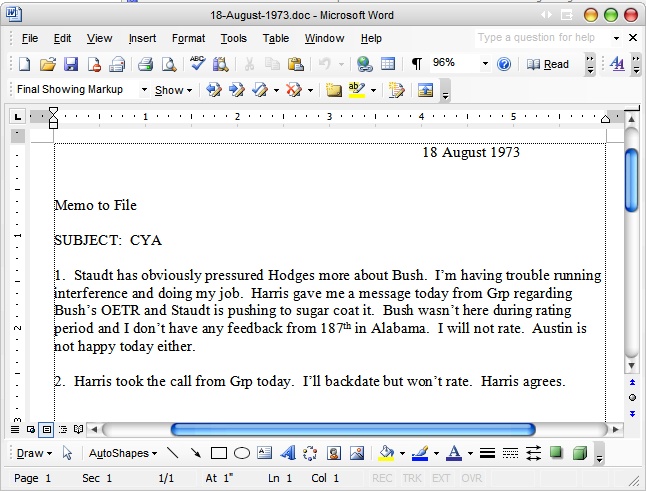
Here's the Word version, compare yourself.
Steve Richter had a lot of links to bloggers who are following the story:
- http://instapundit.com/
- http://wizbangblog.com/
- http://www.powerlineblog.com/
- http://www.littlegreenfootballs.com/weblog/weblog.php
- http://justoneminute.typepad.com/main/
- http://ace.mu.nu/archives/045480.php
About Scott
Scott Hanselman is a former professor, former Chief Architect in finance, now speaker, consultant, father, diabetic, and Microsoft employee. He is a failed stand-up comic, a cornrower, and a book author.
About Newsletter

You quote someone who is not a document analyst as saying "he doesn't but it" but at least some document analysts do buy it.
In addition the army base where he worked had one of these typewriters capable of producing the "th".


He used pull to get into the guard ahead of a long waiting list.
He also clearly got out using his father's influence.
The whitehouse defence is that he was "honorably discharged" so he must have met his commitments.
But the truth is that daddy made some calls to get him out.
I've seen the same th in a memo released by the whitehouse as part of the president's record.
Nonetheless the fact that President received favorable treatment and lied about what he did when he was in his early twenties really is less relevant than his actions in the last 4 years.
He has dropped the ball on protecting the US from Terrorism.
Iraq was contained and had no weapons of Mass Destruction. Yet we followed a plan that Wolfowitz et.al. had championed for years before 9/11. I won't go so far as to say the administration was outright lying to congress and the american people (although they may have been). But they at least failed to listen to all the intelligence.
Now we have a huge debacle in Iraq that is going to consume our military and finances for years to come. The Iraqi people hate us. We have committed all kinds of attrocities in Iraq. And George Bush has proved to the middle-east that we are "evil". (Yesterday the US killed 60-80 civilians firing on them from a helicopter).
Iraq is now a training ground for terrorists.
Afghanistan continues to be a world-wide supplier of illegal drugs and will never be a democracy.
We have squandered all the good-will the world felt towards the US after 9/11.
Meanwhile North Korea is preparing to test nuclear weapons and has delivery systems (rockets) capable of reaching California.
Iran thumbs its nose at the US knowing we are too over-extended to do anything militarily and do not have the standing in the international community to bring sanctions.
Saudi Arabia which is the largest sponser of terror, and the source of the Bush family fortune, has had no sanctions imposed on it.
And then there is domestic policy:
This administration takes every opportunity to give away the store to corporate donors:
Energy policy - written for and by Enron
Environmental policy - Open drilling in wild-life preserves to Bush's oil buddies
Medicare reform - In exchange for "drug cards" agree not to regulate pharmaceutical companies
And what happened to fiscal conservatism?
OK I can understand republicans believe in smaller government. But the government expenses have grown to a huge extent under this administration while cutting taxes. Look borrowing money makes sense if you are investing in a large purchase. But they seem to be just ignoring the deficit. They won't even submit estimates on the cost of the war.
Most people see only what they want to see...But everyone is so smart.
I think what Hanselman posted about is all good. But when folks start making these broad comments claiming to know everything about each candidate...that's a little bit too much.
What I DO know though, is that these docs are forgeries, so let's fire someone. :)
There were several manners in which to produce them, depending upon model. The two basic methods I used were: 1) a standard Executive with a variable-advance platten could be used with the proper golf-ball that contained the subscripts, superscripts, fractions, and ligatures (which was one way I produced of newsletters for the university computer center at which I worked), and 2) using a Composer and knowing the function codes for the special characters.
Throughout the university where I worked there were many Executives and Composers that were being using for those special characters to type many Master and Doctoral theses. (The Chemistry department produced many theses which used all four types of special characters.) If you can find any chemistry thesis from the 70's you'll see examples of special characters, along with proportional spacing and horizontal leading (what some are calling "centering").
Concerning the keyboards: all models of Selectrics could be special-ordered with various special keys. The Executive I used for several years had subscripts, superscripts, and a half-dozen ligatures as special "function" shift key values (which necessitated leaving in the correct golf-ball with all the characters...else you'd get the wrong characters!).
Concerning the golf-balls (or "font-balls" if you will): all of them had a limited number of positions, and thus most good typists of the time had a collection of several (esp. if you were involved with typing technical documents). My collection of 8-9 balls included several office fonts, a mathematical symbol set, several APL sets, and 3-4 sets of dingbats. Of course, several of the golf-balls came in handy when using my favorite timesharing terminal of the day, the 2741 (which was a Selectric on steroids...briefly described at http://www.columbia.edu/acis/history/2741.html). Dealing with APL at several different computer centers necessitated having several different APL golf-balls...since there were several APL dialects at the time (each with slightly different operators and it's own keyboard layout). One of the obvious reasons for the golf-balls was to supply non-English character sets. I remember having a catalog for them which contained dozens to choose from... (Most of the "extra" golf-balls I ended up buying myself directly from IBM, in my zest to cover all possible characters, such as letters having diacritical marks over them which weren't on some of the normal office font balls...)
Regarding the "th" ligature: the various methods of producing them will show slightly different size, kerning and base-line alignment. A lot of typists that had Executives didn't have either the variable-spacing plattens (only had the half-spacing plattens) or the built-in special characters on their keyboards, and were stuck swapping golf-balls each time they had a special character. They simply had to know the proper key to hit while holding down the "function" key. (IBM provided keyboard maps and keyboard stickers with golf-balls for this purpose.) ((This was a maddening torture upon typists...which usually drove many to demand buying the top-end Executive or Composers... I personally know of two secretaries that quit over their managers refusing to upgrade them to Composers.)) Fortunately, I had one of the keyboards that had a half-dozen ligatures.
Having also worked with the world's first 3rd generation phototypesetter, I developed a keen eye for font design and rendering...and wrote several rather complex typesetting applications that exploited many typesetting tricks to achieve their goals. Nothing I've read or seen so far looks like a "smoking gun" of forgery. I assert that most of the people making these claims have NOT used the specific models of Executives or Composers with all the special chracters built-in...and thus, should NOT be considered experts.
Although I won't rule out the possibility of forgery, IBM Selectrics were used FREQEUENTLY to produce such documents. (If I had access to the appropriate model and golf-ball, I'm pretty sure I could produce the same letter...with the same spacing and special characters.) The fact that one can use a word processor to reproduce a document that almost exactly "overlays" a document that was supposedly typed back then doesn't surprise me: common fonts (such as the Roman famiily) were stolen willy-nully by all parties involved with the invention of 2nd and 3rd generation phototypesetters, and their source material to digitize fonts were the original hot lead and typewriter fonts...all the way down to the kerning and base-line alignment. When fonts were originally digitized in the early 70's, IBM's fonts were stolen by many font-makers.
One thing to keep in mind is that the font digitization industry had a vested interest in keeping the same look and feel as hot lead and typewriters: many publishers (specifically newspapers, magazines, and oddly enough, dictionary and law publishers) were being pretty obstinate about switching from tried and proven serif fonts like the Roman family to other font families during the first generation of word processors in the early 70's. (I should know: the company for which I worked published all the major dictionaries and major law books... They all wanted the exact same look and feel as their previously published books and resisted changing to newer recently digitized fonts, even to save on page count!)
Thus, to those looking at the size, kerning, base-line alignment, and proportional spacing as "smoking gun evidence"...simply because you believe the technology did not exist at that time: sorry, but you're mistaken! It DID exist in several forms, both in typewriters (and IBM wasn't the only one producing them!) and as digitized fonts in 2nd and 3rd generation phototypsetters. (I.e., the technology didn't magically come about with the appearance of FrameMaker, WordPerfect, or Word...)
* Use a type setter?
* Swap out a golfball but he won't write in complete sentence?
* For that matter, is a male officer in 1973 type his own memo or dicate it to a woman?
Again, this isn't politics, I'm actually for Kerry, but this is about someone going "File|New|Forgery".
It's all a bunch of non-expert navel gazing. I'm deeply saddened that this kind of superficiality has become emblematic of us as a country.
I don't care if it's interesting or not; the country would be much better off if we spent this much time as a group worrying about the defecit, our security and the future.
I'm wrong at least once a day, though, so I could be wrong here, too. I am not a typegeek, but I am enough of a geek to notice more a difference between the positions of those superscripts than there is between the 2 candidates running for President at the moment.
(I don't care about either Candidate's service, honestly, I was going doody in my diapers at the time, I hope we've all changed drastically since then, even though we were doing what we believed to be the right thing at the time. However, if the docs are fake [and I have seen little reason to believe they are] that would be a huge problem in my opinion.)
"You know, (the documents) probably are altered and they probably are forgeries and I think that's terrible, really."
First lady Laura Bush, to Radio Iowa
http://www.cbsnews.com/stories/2004/09/06/politics/main641481.shtml
However, the superscript in both docs in the animated gif is the same position. Those 2 fonts appear to be the same. Neither of which is the same font as the one you used (unless there are some config settings that caused the change).
I was originally comparing your Word doc but that is not really applicable to the real argument at all. Sorry for the distraction.
"BIG UPDATE: Turns out they ARE fake. "The man who gave CBS News disputed documents describes how he obtained them; in television interview, he admits he deliberately misled a CBS News producer."
The article says "it cannot prove they are authentic", not that they are fake. That's quite a conclusion to jump to there, don't you think? "Absence Of Evidence Is Not Evidence Of Absence"
Comments are closed.
But for the humorous side of this, check out this version of clippy:
http://politicalities.typepad.com/politicalities/2004/09/forgery_follies.html