First time here? Check out the site's "greatest hits" or read a post from the archives. Feel free to leave a comment or ask a question, and consider subscribing to the latest posts via RSS or e-mail. Thanks for visiting!
Do you Tweet? Follow me on Twitter @shanselman or learn how to use Twitter!
« Hanselminutes on Channel 9 - Video #1 | Main | A better automatic translation system - ... »

I deal with a lot of data in my day job. We're always trying to figure out the right way to visualize some chunk of data. Being able to think about the visualization of quantitative information start with thinking beyond basic bar and line charts.

We're looking into schools for Zenzo, and we have some specific categories that we're using to rank the schools, like for example:

  • Cost
  • Spanish
  • Sign Language
  • Teachers
  • Recommended
  • Location
  • Curriculum
  • Vibe
  • Schedule

We're going to look at many schools, so we're looking at a grid here, with each category ranked, say, 1 to 10, where 10 is awesome, and 0 sucks.

We could make a bunch of line/bar charts...

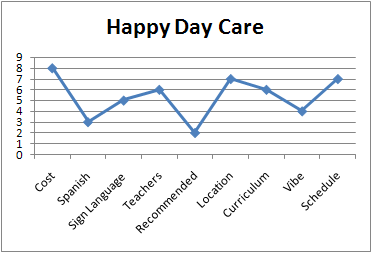
...and it kind of works if force ourselves to remember that a straight line all the way across the top means "good."

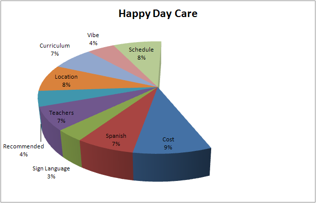
We could view the data as a pie chart if we introduce a gap in the pie that indicates that missing "goodness." The fuller the pie, the better the daycare:

If we didn't like the pie because it doesn't really characterize the information enough where we could actually make a decision, we could try a closed donut that includes all the choice:

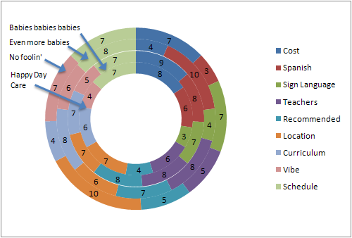
The donut really doesn't work because there's an implication that the ordering of the rings indicates a qualitative (actually quantitative) judgement. The order in this case is meaningless.

This particular dataset lends itself to being a Radar Graph. You can think of a Radar Graph as just a Line Chart wrapped around a single point so that left-right presentation of data on the horizontal of the x-axis (as is in a Line Chart) doesn't get misinterpreted as being meaningful.

We can present the data into two ways, either all mushed together...

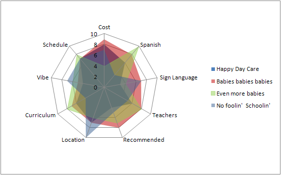
...but the Z-ordering again has the same problem as the donut - it implies that the one on top is better. If the data is solid, then one covers the next, but if it's transparent, the color turns to brown. This data really wants to have each series next to each other.

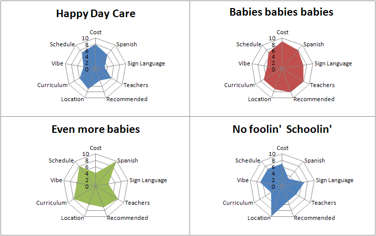
There we go. Now it becomes clear that "Babies babies babies" is the most balanced of the four.

If you're a UI programmer, or a UX designer, you should be a connoisseur of this kind of stuff. Don't fall into the trap of throwing your data into a simple grid. The data "wants" to be presented in a certain way. It's your job to find that appropriate visualization.

Be sure to remember that axes lie. If you're using logarithmic or adjusted axes, you should know what the psychological ramifications are of these changes. You can inadvertently bias the data and lead you viewer to non-objective conclusions. The US Today "info-graphic" is notorious for this kind of things.

Above all, remember there's more available to you than just Pie Charts and Bar Charts.


Thursday, March 29, 2007 12:01:10 AM (Pacific Standard Time, UTC-08:00)
hey scott,
about that last line 'Pie Charts and Bar Charts'; for most people there are not. Your target audience makes a *huge* difference on what sort of graphs you can use. Though that doesn't mean you can't try and show them the way ;)

Adam
Thursday, March 29, 2007 2:32:31 AM (Pacific Standard Time, UTC-08:00)
The approach here however assumes that each category is equally as important as all others which is unlikely the case.

You need to put a weighting next to each category and multiply the score by that weighting before turning it into a graph ;-)

Unless of course not having a recommendation really is as important as being far away or expensive.

[)amien
Thursday, March 29, 2007 2:55:58 AM (Pacific Standard Time, UTC-08:00)
Great post, although I'm not sure what's more disturbing. The fact that you went through all this to produce graphs to select a school, or that there's a school out there called "Babies babies babies". Just doesn't sing does it? Maybe one of your axes should have been "Sillyness of name" ;)
Thursday, March 29, 2007 3:50:13 AM (Pacific Standard Time, UTC-08:00)
I agree with Damien, most factors don't carry the same importance or weight. I use Excel to create a grid of weighted factors and then score each alternative. That gives each alternative a score. Coming from an operations research background, I like to play with the weights and see just how much I can change a weight before it alters the ranking. There used to be a site online called provenclarity.com that had a nice Flash UI that would allow you to do the same thing but it's been taken down.
Thursday, March 29, 2007 4:30:00 AM (Pacific Standard Time, UTC-08:00)
To be honest, I'm a bit disappointed that none of these graphs represent causation as to where all of these babies are coming from, isn't that the real elephant in the room?

Hmmm.. I am going to call my mom and see if she knows where my little brother came from.
Thursday, March 29, 2007 4:31:52 AM (Pacific Standard Time, UTC-08:00)
+1 for the Spanish (or any foreign language) and +1 for the Sign Language (ASL I presume?)

I think more schools should be teaching multiple languages starting in kindergarten. Kids learn it faster, and it makes them more competitive in the business world in the long run.
Thursday, March 29, 2007 4:32:48 AM (Pacific Standard Time, UTC-08:00)
I always thought this chart of Napoleon's march was a great example of showing a lot of data on a single chart.

http://www.edwardtufte.com/tufte/minard

John
John
Thursday, March 29, 2007 5:09:56 AM (Pacific Standard Time, UTC-08:00)
John, it's often cited as possibly the best graph representation thingy (sorry the brain is a little fried/jet lagged or I'd describe what it is a little better). Anyway, the point is that it's supposed to be the best example of one.
Ian
Thursday, March 29, 2007 7:13:36 AM (Pacific Standard Time, UTC-08:00)
If you need some inspiration, check out this "Periodic Table" of visualization:

http://www.visual-literacy.org/periodic_table/periodic_table.html

- Paul.
Thursday, March 29, 2007 7:19:17 AM (Pacific Standard Time, UTC-08:00)
Heh, yes, I know that weighting is important...I was trying to simplify the whole thing, but I probably should have included relative weights. :) Actually *poor* or artificial weighting is another way to get an axis to lie for you.
Thursday, March 29, 2007 1:29:31 PM (Pacific Standard Time, UTC-08:00)
Scott, are you using a charting package to generate these via code? Or is this standard excel stuff? Either way, what do you use for charting in web-apps?
Alan
Thursday, March 29, 2007 1:36:58 PM (Pacific Standard Time, UTC-08:00)
For this particular kind of data, I think the "Consumer Reports" charts are quite natural and effective. And they have the benefit of displaying all this data on a single grid, rather than requiring you to have a separate drawings for each instance.

But then you have to decide what your cut-offs are for each property. This is really no different than weighting them, though.
Thursday, March 29, 2007 8:49:28 PM (Pacific Standard Time, UTC-08:00)
c - Great point! I'll try that kind of chart/table.

Alan - Just Excel 2007...
Friday, March 30, 2007 5:29:04 AM (Pacific Standard Time, UTC-08:00)

Two thoughts:

1.) Write your perfect job description for the next job you want.

2.) Create a weighted job interview scoring system to be more prepared. It will also identify personal short comings.

Now do the same thing for your personal life.
Scott
Comments are closed.

Contact

Sponsors

Hosting By

Hot Topics

Tags

Calendar

<July 2009>
SunMonTueWedThuFriSat
2829301234
567891011
12131415161718
19202122232425
2627282930311
2345678

Archives

July, 2009 (4)
June, 2009 (26)
May, 2009 (16)
April, 2009 (13)
March, 2009 (17)
February, 2009 (17)
January, 2009 (18)
December, 2008 (32)
November, 2008 (17)
October, 2008 (22)
September, 2008 (16)
August, 2008 (14)
July, 2008 (25)
June, 2008 (19)
May, 2008 (17)
April, 2008 (17)
March, 2008 (26)
February, 2008 (21)
January, 2008 (28)
December, 2007 (19)
November, 2007 (17)
October, 2007 (31)
September, 2007 (39)
August, 2007 (37)
July, 2007 (43)
June, 2007 (37)
May, 2007 (32)
April, 2007 (38)
March, 2007 (29)
February, 2007 (46)
January, 2007 (31)
December, 2006 (27)
November, 2006 (31)
October, 2006 (32)
September, 2006 (39)
August, 2006 (34)
July, 2006 (40)
June, 2006 (18)
May, 2006 (31)
April, 2006 (34)
March, 2006 (30)
February, 2006 (38)
January, 2006 (44)
December, 2005 (19)
November, 2005 (34)
October, 2005 (24)
September, 2005 (37)
August, 2005 (20)
July, 2005 (24)
June, 2005 (33)
May, 2005 (16)
April, 2005 (22)
March, 2005 (34)
February, 2005 (15)
January, 2005 (37)
December, 2004 (28)
November, 2004 (30)
October, 2004 (34)
September, 2004 (22)
August, 2004 (34)
July, 2004 (18)
June, 2004 (64)
May, 2004 (49)
April, 2004 (21)
March, 2004 (29)
February, 2004 (29)
January, 2004 (36)
December, 2003 (25)
November, 2003 (24)
October, 2003 (59)
September, 2003 (42)
August, 2003 (24)
July, 2003 (44)
June, 2003 (29)
May, 2003 (21)
April, 2003 (30)
March, 2003 (27)
February, 2003 (47)
January, 2003 (50)
December, 2002 (31)
November, 2002 (38)
October, 2002 (44)
September, 2002 (15)
May, 2002 (2)
April, 2002 (4)

Google Ads