Scott Hanselman

Learning about Progressive Enhancement - Supporting Mobile Browsers with CSS3 Media Queries

August 25, 2011 Comment on this post [32] Posted in ASP.NET | ASP.NET MVC | Javascript | Mobile
Sponsored By

This site on an iPhone 4This site on a Windows Phone 7 MangoI blogged about how happy I've been working with designer Jeremy Kratz on my recent site redesign. We've been meeting lately about small improvements and tweaks. One of the core goals was to support many screen sizes from 30" down to a small smart phone screen. You can see the results on the right in a Windows Phone and iPhone.

My team is doing a lot of work on Mobile lately, not just with things like jQuery Mobile and what that means not just for ASP.NET but the mobile web in general. We've also worked with 51Degrees and they've even created a NuGet package that can help you tailor your site to any device. You'll hear more about Mobile in ASP.NET from Steve soon and I'll be sharing some ideas in a few upcoming conferences.

I originally enabled this blog for mobile browsing this same week in 2006. That's 5 years ago, when mobile was really just getting started. Back then, I had a separate mobile view that was stripped down and emitted totally different markup based on user-agent sniffing. This was pretty innovative for the time, a half decade ago. There's a number of things in ASP.NET 2 (what this blog runs on) that do adaptive markup. However, more modern techniques use a combination of detecting capabilities on the server side with feature detection on the client. We query the browser with JavaScript: Do you support Geo-Location natively? No? How about using this shim JavaScript library?

When laying out a page, rather than serving up different markup on the server based on the server-detected browser, we can also use CSS3 media queries that modify a layout based on screen (viewport) size. I wanted to use these techniques for this blog.

While I realize that some people want a totally custom iPhone web application when they visit a site, I draw a specific line between a Web Site, a Mobile Web Site and a Mobile Web Browser Application. When visiting what I consider a regular web site, I don't want an iOS-specific Web version and a Regular Web I can't see. What I'd like to see is the site I went to, perhaps with alternative elements or a few things moved around.

However, if the site is full of interactivity, I might want a Mobile Web Site served up with different - perhaps device-specific - markup for different Smart Phones. I think the decision point for how application-like, and therefore device-specific, your mobile website should be hinges on how much your user will be interacting with it vs. just reading/consuming content.

With this blog, there's not a lot that needs to be smart phone specific. I want a mobile-optimized version of the site, not a complete iOS (or Android, or WP7  or whatever) re-imagination of the site. If I did, I'd download an app.

If you're creating a Web Application that focuses on "producing" (meaning pushing buttons, doing application stuff) I can see using a phone-specific framework, but when "consuming" content, I'd like my Web Site to look like a Web Site.

CSS3 Media Queries

Designer Jeremy and I (mostly him!) came up with a goal to support desktops, tablets and netbooks around 1024 pixels wide, and phones less than or around 720 pixels wide.

Here's the general structure of the CSS. Note that none of this is JavaScript. This is all just descriptive "when the screen is like this, apply these styles" stuff.

/* psuedo CSS, not complete */

/* CSS Reset from http://meyerweb.com/eric/tools/css/reset/

Goes here
*/

/* Global Styles for the Desktop Site */


/* Force the images to resize smaller
when they get squished with small screens */
img
{
width: auto !important;
height: auto !important;
max-width: 100%;
}

/* bunch of styles */

/* Hide the dropdown we'll use for
navigation when we are tiny */
#nav select
{
display: none;
}

/* Tablet device styles */

@media screen and (max-width:1024px)
{
/* hide stuff, make things smaller, yank the right rail */
#sidebar
{
display: none;
}
/* hide other stuff */
}


/* Phone device styles */

@media screen and (max-width:720px)
{
/* hide the huge top nav and show the nav dropdown */
}

Desktop vs. Mobile Site Navigation

Everything looks nice, until you resize the site and the top navigation bar really got squished, then overflowed. However, Jeremy had a great idea. The navigation at the top is nice, but when the screen is REALLY small the navigation is overwhelming. The navigation is just an unordered list like this:

<div id="nav">
<ul id="primarynav">
<li id="nav-info"><strong>Info</strong>
<ul>
<li><a title="Learn more about Scott Hanselman" href="http://www.hanselman.com/blog/AboutMe.aspx">About Me</a></li>
<li><a title="Contact Scott Hanselman" href="http://www.hanselman.com/blog/contact.html">Contact Me</a></li>
</ul>
</li>
<ul>
...more..
</div>

Why not show that as a dropdown for tiny screens? There's actually a StackOverflow question on that (did you know Jeremy did the initial StackOverflow design?) I could certainly just put a dropdown in a DIV and hard code it, but since the structure already exists in a UL and I might want to change it in the future as well as avoid duplication, we'll use JavaScript to inject the SELECT into the HTML DOM (Document Object Model).

Basically we just spin through the UL structure and create the select, options and (bonus!) option group using the existing hierarchy.

$(document).ready(function() {
var markUp = ["<select id='primarynav-select'>"], $li, $a;
markUp.push("<option value='' selected='selected'>Go to...</option>");
$("#primarynav > li").each(function(){
$li = $(this);
if($li.find("li").length){
markUp.push("<optgroup label='"+$li.find("strong").text()+"'>");
$li.find("li").each(function(){
$a = $(this).find("a");
markUp.push("<option value='"+$a.attr("href")+"'>"+$a.text()+"</option>")
});
markUp.push("</optgroup>");
}
else{
$a = $li.find("a");
markUp.push("<option value='"+$a.attr("href")+"'>"+$a.text()+"</option>")
}
});
markUp.push("</select>");

$("#primarynav").after(markUp.join(''));
$("#primarynav-select").change(function(){ window.location = $(this).val(); });
});

So this,

The navigation menu as a UL

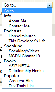
becomes this, when you resize the browser really small, just by hiding the one and showing the other using the CSS above.

The UL Navigation menu as a Select Dropdown box

Resizing Images for Small Screens

For an important site that gets a lot of mobile traffic, you would want to use a browser database like 51Degrees that could tell you the size of the screen of a specific phone and the graphics formats (PNG, JPG, transparency or not) so you could resize large images on the server side and return mobile-optimized images. You could have a handler that detects small phones with small screens then resizes and caches images. Perhaps even grayscales them for non-color phones.

In my case, my images aren't that large and it's not that important to me to do server-side resizing. Instead we decided to have the images resized on the client side using CSS like this:

img
{
width: auto !important;
height: auto !important;
max-width: 100%;
}

This says, no matter what other CSS or the markup says, it's important that images resize to 100% but no larger. This was a nice simple solution for those larger photos that I put at the top of each post. Rather than overflowing and clipping against the edge of the phone, then resize. You can see this in action by just resizing your browser.

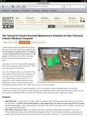
Here you can see this site on an IPad. Note the right rail has disappeared. On the right, the same post on an iPhone 4 which is 640px wide. See how the image has moved up and is the width of the phone?

This site on an iPad  This site on an iPhone 

You can even use CSS Media Queries, without any JavaScript, to detect iPad orientation, or if the user has an iPhone 4 with high-res retina display vs. a low-res iPhone 3G.

Here's example CSS from Web Designer Wall, credited to Thomas Maier and Cloud Four respectively.

<!-- Detect iPhone4 Retina Display from CSS -->
<link rel="stylesheet" media="only screen and (-webkit-min-device-pixel-ratio: 2)" type="text/css" href="iphone4.css" />

<!-- Detect iPad and iPad orientation -->
<link rel="stylesheet" media="all and (orientation:portrait)" href="portrait.css">
<link rel="stylesheet" media="all and (orientation:landscape)" href="landscape.css">

You can actually test and simulator the orientations locally by making your desktop browser wider than it is tall.

There's still a few things left to tweak, and these techniques only work with modern Smart Phone browsers that support these features, but for the 8% of you who are reading this blog on a mobile device it should be a better experience now.

One Caveat - Code Samples

As with all nice things, there is one bad thing. The code samples that I have use SyntaxHighlighter. It takes a <pre> and using JavaScript does a lot of work on them, effectively replacing the PRE in the DOM with a bunch of stuff. This looks lovely in a desktop browser and crappy on mobile. I'm still exploring how to fix this. Here's some ideas I have.

  • Conditionally override the SyntaxHlighter CSS using Media Queries
  • Change the plugin to keep the <pre> around, but hidden. Then swap the highlighted one with the plain one on phones
  • Come up with better CSS all up for the highlighter

I'm interested in your thoughts!

UPDATE: I'm currently reading Adaptive Web Design: Crafting Rich Experiences with Progressive Enhancement as it's amazing. Aaron gave me a review copy to check out. He outlines a similar UL to SELECT enhancement and a dozen others in a clear, clean readable manner. I'm enjoy it thoroughly.

Related LInks

About Scott

Scott Hanselman is a former professor, former Chief Architect in finance, now speaker, consultant, father, diabetic, and Microsoft employee. He is a failed stand-up comic, a cornrower, and a book author.

facebook bluesky subscribe
About   Newsletter
Hosting By
Hosted on Linux using .NET in an Azure App Service

The Technical Friend's Essential Maintenance Checklist for Non-Technical Friend's Windows Computer

August 24, 2011 Comment on this post [77] Posted in Musings | Tools
Sponsored By

World's Dustiest Computer I visited a friend today and noticed their computer. Of course I did, that's what we do. It was, as are all non-technical computer friends' computers, a 3 year old gray Dell mini tower with a 17" flat screen. In fact, these are the ONLY computers that non-technical computer friends own, you know.

I was there to visit, but I'm genetically incapable of NOT doing a system's check on an old PC. "How can these people LIVE like this?"

If you are reading this blog, you have been in this very situation. Perhaps your wife is waiting in the car to go home even after a lovely dinner with your couple friends and you'll be there in "5 minutes" but you're actually hypnotized by the defragmenter, trying to influence the hard disk head's pixel indicator with your mind. Which sector is next...damn! Immovable!

It's a dance, what we do to our friend's computers, isn't it. It's a dance we done a thousand times, but one that is comforting in its steps. Not surprised, nothing unknown, just maintenance. We've said one day we'll write a script, one day we'll create the ultimate batch file to do all this, but until then, click, download, install, update, rinse, repeat.

Hardware

  • RAM RAM RAM - I've got sticks of the stuff. Today my neighbor had a 512meg machine that was just sad to look at. I've said before, a machine with too little RAM is a three legged dog. You know he's gonna get where he's going but it's hard to watch. I had a couple of gigs of PC-5300 in the car for some reason and I just added it and got them up to 2gigs. Minds were blown.
  • WEI: Window Experience Index - I've gotten into the habit of pressing 'WindowsKey+PauseBreak' on any new Windows Machine to take a look at the Windows Experience Index. It's the number that will tell you, reasonably and quickly, how much your friend's old computer sucks. The top score is currently a 7.9. Usually these machines are 3s and 4s. The important part is the the score is the lowest scoring component. The best part is that most of these low scoring components are cheap. $50 for some RAM, $50 for a new  HD, $50 for a decent Video Card. Update the crappiest part. Again, chances are you have better hardware lying around in your junk drawer than does Non-Technical Friend.

Software

  • Update Drivers - Non-Technical Friend always has a piece of hardware that doesn't work correctly, usually a printer, sometimes an All-In-One scanner/printer/fax. Almost always getting the right drivers solves it. Help them out.
  • Windows Update AND Microsoft Update - They usually haven't set Windows Update to automatically install updates at 3am, and they never have clicked "Yes" to get updates for other Microsoft products. (You have to opt-in.) Visit http://www.microsoftupdate.com on machines before Windows 7 and run the Windows Update applet on Windows 7 and setup updates for Microsoft products (Office, etc. as well as Windows.) Make sure they've got the latest Service Packs for Windows and Office.
  • Anti-Virus - When I visited my friend today I was surprised to see that they had Anti-Virus and Anti-Malware software installed. Always a refreshing surprise. However, they had several installed, and they were fighting. They had AVG, Windows Defender, PC Optimizer, SpyBot, and two other playfully named "anti-spyware" applications as well as four browsers toolbars. I uninstalled the whole lot and installed Microsoft Security Essentials. It's simple, lightweight, solid and free. It's also free on up to 10 PCs for Businesses.
  • Uninstall anything evil - If you want to get a quick look at what's on a machine and uninstall LOTS quickly, look no further than NirSoft's My Uninstaller (download). Remove Toolbars (they think they need them and they never do and won't miss them), and anything that looks like it might destabilize their system. I check out toolbars, add-ins, etc.
  • Update Stuff that can't Update Itself - I usually install FoxIt Reader or at least update Adobe Acrobat and Flash. I updated their Firefox 3.6 (!) to Firefox 6 and installed IE9.
  • Backups or at least DropBox - I always ask "Is your stuff backed up" and they always say "I have been meaning too" or "On my thumb drive last month." I should start charging folks to install DropBox. In this case, I thought about Mozy but my friend really just needed some documents backed up so now they've got DropBox with 2GB free. Windows Live Mesh is another decent option if they are Hotmail/Live Messenger users. Regardless, for goodness sake, get their data to the cloud!

Teaching

  • Tell them about Security - Wanna freak them out? Ask your friend for the last four digits of their social security number (or national id) then hit the Start Menu and search for it. You'll almost always find Excel files, Word documents or PDFs with their super-private information. I've often found scans of their actual id cards. This trick also works with their credit cards. Teach your friends to not keep personal information on their machines.
  • Teach them about History - Avoid looking at Non-Technical Friend's browser history or searching Google for anything that starts with "a", "p" or "s." You don't need to know Non-Technical Friend that well. Perhaps come up with an excuse to teach them about Private Browsing or "Incognito" if you're cool like that.
  • Teach them about Passwords -  Explain how passwords work to your friends. Suggest they use pass phrases, add complex characters, stop saving their passwords in the browsers. If they are cool with it, clear their passwords in their browsers and suggest a password manager.

Maintenance

  • Cleaning - Explain to them the importance of cleaning (or burning) their 10 year old keyboard. Computer keyboards are dirtier than toilets. That's a fact I just made up and I'm totally sure it's true. Get that biomatter off your keyboard and mouse. You wouldn't lick your keyboard but you'll type it on for hours then touch your face. You nasty.
  • Blow the Dust out of their System - It's just the right thing to do. Seriously, keep a bunch of Cans of Air Dusters in your car. I do. Get out the vacuum at your friends house, give them proper warning that it's gonna get NASTY up in here and open up their computer. Chances are this is the first time it's ever been open. It's probably got that "there's a weird sound in the back" groan that's indicative of dust in the power supply. I can't tell you how many times I've just jammed a pencil in there just to get a computer to SHUT UP.
  • Defrag - Of course Windows has its own defragmentation program but I love the MUCH better Auslogics Disk Defrag
  • Startup Programs - Get AutoRuns (or RegEdit to HKLM\Software\Windows\CurrentVersion\Run) and clean up all the random stuff that's starting up but they've forgotten why. If they are slightly technical, suggest Soluto for fixing their startup issues.
  • Tidy Up - Non-Technical Friend typically has some toolbar - perhaps an Explorer Folder or something - pinned off to the far left side of their screen and isn't sure how it got there or how to get rid of it. Clean up these things.
  • Crap Cleaner - It used to be called Crap Cleaner but now it's tamely known as CCleaner and it's the only "cleaner" I trust. I also run Disk Cleanup (as Administrator) that comes with Windows.
  • Resolution - Non-Technical Friend always has a 17" LCD with a native resolution of 1280x1024 but runs their system at 1024x768 and never understands why everything looks blurry. Save them.
  • Join.me - Show them how Join.me works and explain that their Technical-Friend-Who-Isn't-You can help them in the future remotely to tidy up and do routine bits and bobs without needing to come over.

Finally, give them a hug and tell them it's OK. What are your favorite maintenance tasks while visiting Non-Technical Friend, Dear Reader?

About Scott

Scott Hanselman is a former professor, former Chief Architect in finance, now speaker, consultant, father, diabetic, and Microsoft employee. He is a failed stand-up comic, a cornrower, and a book author.

facebook bluesky subscribe
About   Newsletter
Hosting By
Hosted on Linux using .NET in an Azure App Service

SlowCheetah - Web.config Transformation Syntax now generalized for any XML configuration file

August 23, 2011 Comment on this post [71] Posted in ASP.NET | Tools
Sponsored By

I did a post last year called If You're Using XCopy, You're Doing It Wrong that also included a video of my talk at Mix10 where I show how to deploy website with Web Deploy. One of the cooler not-very-well-known features is called Web.config Transformation. Once folks see it, then immediately want a general solution.

First, from the previous post:

You can right-click on your web.config and click "Add Config Transforms." When you do this, you'll get a web.debug.config and a web.release.config. You can make a web.whatever.config if you like, as long as the name lines up with a configuration profile. These files are just the changes you want made, not a complete copy of your web.config.

You might think you'd want to use XSLT to transform a web.config, but while they feels intuitively right it's actually very verbose.

Here's two transforms, one using XSLT and the same one using the XML Document Transform syntax/namespace. As with all things there's multiple ways in XSLT to do this, but you get the general idea. XSLT is a generalized tree transformation language, while this deployment one is optimized for a specific subset of common scenarios. But, the cool part is that each XDT transform is a .NET plugin, so you can make your own.

<?xml version="1.0" ?>
<xsl:stylesheet xmlns:xsl="http://www.w3.org/1999/XSL/Transform" version="1.0">
<xsl:template match="@*|node()">
  <xsl:copy>          
    <xsl:apply-templates select="@*|node()"/>
  </xsl:copy>
</xsl:template>
<xsl:template match="/configuration/appSettings">
  <xsl:copy>
    <xsl:apply-templates select="node()|@*"/>
    <xsl:element name="add">
      <xsl:attribute name="key">NewSetting</xsl:attribute>
      <xsl:attribute name="value">New Setting Value</xsl:attribute>
    </xsl:element>
  </xsl:copy>
</xsl:template>
</xsl:stylesheet>

Or the same thing via the deployment transform:

<configuration xmlns:xdt="http://schemas.microsoft.com/XML-Document-Transform">
<appSettings>
<add name="NewSetting" value="New Setting Value" xdt:Transform="Insert"/>
</appSettings>
</configuration>

This kind of config file transformation is so useful in fact, that it's one of the #1 feature requests...as a generalized solution. Folks want to transform their app.configs, or any XML file as part of their builds. Additionally, the current system only runs the transforms as a part of the publish process and folks would rather the transform happen "on F5" or on build. So, my team members Sayed Ibrahim Hashimi and Chuck England have done just that as a small VSiX called SlowCheetah XML Transforms.

In this screenshot I've created a simple Console Application, made a basic app.config, then right clicked and selected "Add Transform." This gives an app.debug.config and app.release.config. You could make and name these however you like, for example app.testing.config, etc.

An app.config file, the transform file, and the result in three panes

For example, here's a basic app.config for my Console app:

<?xml version="1.0" encoding="utf-8" ?>
<configuration >
<appSettings>
<add key="appName" value="Something"/>
<add key="url" value="http://hanselman.com/"/>
<add key="email" value="awesome@hanselman.com" />
</appSettings>
</configuration>

And here's the transform to change my one value in my development time config to a debug value (or test, staging, etc). You can do this for connectionStrings, app keys, compiler settings, anything in an XML or config file.

<?xml version="1.0" encoding="utf-8" ?>
<configuration xmlns:xdt="http://schemas.microsoft.com/XML-Document-Transform">
<appSettings>
<add key="appName" value="Demo-debug" xdt:Transform="Replace" xdt:Locator="Match(key)"/>
<add key="email" value="debug@contoso.com" xdt:Transform="Replace" xdt:Locator="Match(key)"/>
</appSettings>
</configuration>

Note the Transform="Replace?" That can be replace, or insert, etc. Lots of choices. The ShowCheetah XML Transform Add-In also adds a "Preview Transform" right-click menu which makes writing these way easier.

The clever part is that there's no magic. All the functionality is installed to %LOCALAPPDATA%\Microsoft\MSBuild\SlowCheetah\v1\ and lives in a standard MSBuild .targets file. You don't even need the plugin if you are installing this on a build server, just copy the files or even check them in with your source and refer to them in your project or MSBuild files. It's added in your project file for you via the tooling like any custom targets:

<Import Project="$(LOCALAPPDATA)\Microsoft\MSBuild\SlowCheetah\v1\Microsoft.Transforms.targets" Condition="Exists('$(LOCALAPPDATA)\Microsoft\MSBuild\SlowCheetah\v1\Microsoft.Transforms.targets')" />

Between the build targets and the added menu items, you get:

  • Added tooling to desktop project to create XDT transforms
  • Ability to transform
    • app.config for desktop projects based on build configuration
    • any XML file to the output folder based on build configuration
  • Added tooling to enable previewing XDT transforms
  • For web projects you can easily transform other XML files during package/publish

Let Sayed and the team know what you think, if it's useful, and if you use it at Sayed's blog, or the SlowCheetah project site on the VS Gallery. Enjoy!

About Scott

Scott Hanselman is a former professor, former Chief Architect in finance, now speaker, consultant, father, diabetic, and Microsoft employee. He is a failed stand-up comic, a cornrower, and a book author.

facebook bluesky subscribe
About   Newsletter
Hosting By
Hosted on Linux using .NET in an Azure App Service

Creating a Podcast Player with HTML5 for a IE9 Pinned Site on Windows 7

August 23, 2011 Comment on this post [8] Posted in IE9 | Javascript
Sponsored By

I was looking at the HTML5Rocks podcast player sample today, and remembered I never blogged about the poor man's Podcast Player that I created for the This Developer's Life for IE9 in April. Currently there's a Flash Player on each page on TDL and one day someone will create the One HTML5 Podcast Player to Rule Them All, but so far I haven't seen it. Most are just one-offs and samples. As is my little demo here.

The HTML5Rocks player has some clever bits to it, and it's worth you doing a View Source and checking it out. There is an empty <audio/> tag at the top of the page and they ask it "can you play MP3s?" and show a compatibility message depending on what it says. You can also put text inside the <audio/> element that will be shown if the element isn't supported at all.

 $('#compatibilityMsg').html('Your browser <strong>' + 
($('#player').get(0).canPlayType('audio/mpeg') != '' ? 'can' : 'cannot') +
'</strong> play .mp3 files using HTML5 audio');

Playing audio with the <audio> tag really couldn't be simpler. The HTML5Rocks sample has some extras like setting volume and seeking that you don't see much in samples.

I wanted to create a little Podcast player for TDL that would combine things like Site Pinning and Jump Lists with some custom buttons for pinned sites and use HTML5 audio for playing the show.

So, the features:

  • Pinnable (drag the FavIcon to the TaskBar)
  • Right-click Jumplist with Recent Shows
  • Play the show with Task Buttons from the Preview
  • Previous, Next, Play, Pause.
  • Minimal code

Plus, I'm lousy at JavaScript. Here's what it looks like in action (as an animated GIF, because those are coming back in style, didn't you hear?) for those of you who don't want to try it yourselves.

Here's the general idea as code.

On the home page there is a list of all the episodes, created from a for loop going through the database of shows. I just added a non-preload audio element next to the div for each show:

<audio id="audio-2-0-4-taste" preload="none" src="http://traffic.libsyn.com/devlife/204-Taste.mp3"></audio>
<div class="episode">
<a href='post/2-0-3-education' class="showlink">
<img src="Images//203-lead.png"
alt="2.0.3 Education" width="320" height="220"/>
<div class='title'>
<p>2.0.3 Education</p>
<div class='description'>
<p>Scott and Rob talk to two developers about the role education has played in their careers</p>
</div>
</div>
</a>
</div>

Every show has an href with a class "showlink." I collect them all and give them to my jQuery plugin:

<script>

$(function(){
$(".showlink").IE9PodcastPlayer();
});
</script>

Comments appreciated as I'm still not awesome at jQuery and JavaScript. There are some options/settings that can be passed in, but I set some defaults that work for me since I did it for this one site.

Basically, I add some buttons, setup click events to go forward and backward through the list of shows passed in.

(function( $ ){
$.fn.IE9PodcastPlayer = function(options) {

var settings = {
'playerStatusDiv' : '#podcastStatus',
'currentShowIndex' : 0
};

this.each(function() {
// If options exist, lets merge them
// with our default settings
if ( options ) {
$.extend( settings, options );
}
});

function initButtons() {
try {
// Developer sample code
if(window.external.msIsSiteMode()) {
// Add buttons listener
document.addEventListener('msthumbnailclick', onButtonClicked, false);

// Add buttons
btnPrev = window.external.msSiteModeAddThumbBarButton('/images/prev.ico', 'Previous');
btnPlayPause = window.external.msSiteModeAddThumbBarButton('/images/play.ico', 'Play');
btnNext = window.external.msSiteModeAddThumbBarButton('/images/next.ico', 'Next');

// Add styles
stylePlay = window.external.msSiteModeAddButtonStyle(btnPlayPause, '/images/play.ico', "Play");
stylePause = window.external.msSiteModeAddButtonStyle(btnPlayPause, '/images/pause.ico', "Pause");

// Show thumbar
window.external.msSiteModeShowThumbBar();
}
}
catch(e) {
// fail silently
}
}

function onButtonClicked(e) {
var btnText = "",
lastIndex = 0;

if (e.buttonID !== btnPlayPause) {

switch (e.buttonID) {
case btnPrev:
btnText = "Previous";
settings.currentShowIndex--;
if (settings.currentShowIndex < 0) { settings.currentShowIndex = 0 };
break;
case btnNext:
btnText = "Next";
lastIndex = $('audio').length-1;
settings.currentShowIndex++;
if(settings.currentShowIndex >= lastIndex) { settings.currentShowIndex = lastIndex };
break;
}

stopAll();
$(settings.playerStatusDiv).text(btnText).fadeIn('slow',
function(){playPause(settings.currentShowIndex)}
);
} else {

playPause(settings.currentShowIndex);

}
}

function stopAll() {
$('audio').each(function(){
try {
$(this)[0].pause();
}
catch(e) {
// fail silently
};
});
$(settings.playerStatusDiv).hide();
}

function playPause(podcastID) {
var player = $('audio')[podcastID];
if(player.paused)
{
player.play();
$(settings.playerStatusDiv).text("Playing...").fadeIn('slow');
}
else
{
player.pause();
$(settings.playerStatusDiv).text("Paused").fadeIn('slow');
}

updatePlayPauseButton(podcastID);
}

function updatePlayPauseButton(podcastID) {
var player = $('audio')[podcastID];
try {
if(window.external.msIsSiteMode()) {
if (player.paused)
window.external.msSiteModeShowButtonStyle(btnPlayPause, stylePlay);
else
window.external.msSiteModeShowButtonStyle(btnPlayPause, stylePause);
}
}
catch(e) {
// fail silently
}
}

function addSite() {
try {
window.external.msAddSiteMode();
}
catch (e) {
alert("This feature is only available in Internet Explorer 9. Bummer.");
}
}

initButtons();
updatePlayPauseButton(0);

if(location.pathname == "/")
{
window.external.msSiteModeClearJumpList()
window.external.msSiteModeCreateJumplist('Episodes');

//This is the stuff we selected and passed in!
this.filter(":lt(10)").each(function() {
window.external.msSiteModeAddJumpListItem($(this).text().substring(41,60), this.href, '/favicon.ico');
});

window.external.msSiteModeShowJumplist();
}

};
})( jQuery );

The one part that I had to hack and still feel yucky about is at the end here with the filter() and substring(). See how I have the truncating of the show title hard coded? I was getting too much text when I passed in the whole <a/> element and children. I need to figure out a cleaner way to tell my plugin about my titles AND my audio files. Comments always appreciated.

If you REALLY want to see a jQuery plugin that will enable pinning and dynamic jump lists and isn't a piece of crap that I wrote, check out Pinify the jQuery Site Pinning Plugin or on NuGet.

About Scott

Scott Hanselman is a former professor, former Chief Architect in finance, now speaker, consultant, father, diabetic, and Microsoft employee. He is a failed stand-up comic, a cornrower, and a book author.

facebook bluesky subscribe
About   Newsletter
Hosting By
Hosted on Linux using .NET in an Azure App Service

Summer 2011 Stats - Tailoring your Blog to your Readers' Browsers

August 22, 2011 Comment on this post [16] Posted in Blogging | Musings
Sponsored By

I was poking around in my Google Analytics and checking out some browsers stats as I wanted to make sure my new site redesign looked good on the browsers that matter to you all, Dear Reader. As I said in the redesign post (insert egotistical self-quote here. Seriously, who DOEs that?):

This new site design looks great in every awesome browser like Opera, IE9, Chrome, FireFox, and even all the way back to IE7. This site looks like a steaming pile of ass in IE6. As it should. 
- Scott Hanselman

Of course, as some internal naysayers are right to say, nayly, these charts are invalid as they are inside the HanselBubble where (they say, these sayers of nay) that we all run Chrome 99 and Beta Builds of Windows 7+1.

Nonsense! I say. It's always interesting to see what the user demographic is. With that, to the charts! First, the big one, Visits by Browser.

Chrome 35%, Firefox 28%, IE 22%, Safari 5% and Opera 2% with a bunch of random stuff that doesn't matter.

Interesting, almost looks like the Google Logo. You've got the big 3 in there almost with 1/3 each, but Chrome is ahead and IE and Firefox are more like 1/4 each. We made sure this blogs and works OK on the top 90% of the browsers that hit it and it should look OK on the rest.

Now, let's drill in. First, Chrome:

Chrome v12 and v13 take up over 50% of the pie

Looks like Chrome's auto-updating strategy sure works. I do worry myself, sometimes, that a security bug will sneak in to one of my thrice-daily Chrome updates, but we'll see. There's a balance between security and stability and new features. I hope they've found it. Everyone is basically on Chrome 12 or 13 it seems. I'm on 15 'cause I'm a canary.

What about Firefox?

Firefox 5 has 58% with 3.6 at 10% and 6 at 8.7%

Nearly 60% on 5.0, but 6.0 is doing pretty well given it JUST came out. I'm a little surprised at the Firefox 3.6 numbers. 10% is a little high, IMHO, but there are those that believe that was a great release and have stuck with it.

Next, Internet Explorer:

IE9 with 43%, IE8 with 42%, IE7 with 11% and IE6 with 2.44% 

Big numbers for IE9. I assume that's because Windows 7 isn't Windows Vista and folks are really liking it. Also possibly that folks who read this blog do Microsoft tech and have installed IE9 to be on the latest stuff. Kudos to Jeremy for getting this site's markup to work on IE9, IE8 and IE7. I'm afraid not for you guys on IE6. I'm sorry your corporation is oppressing you.

Screen Resolution

Y'all got some LARGE monitors and high-resolution displays! 90+% of my readers are running screens wider than 1024x768.

90% of my readers are running larger than 1024x768

One could argue from these numbers that I could target 1280 as a browser width, but with this new redesign Jeremy and I decided to support not only mobile (decently, although we need to take a deeper look at how to make the fonts more readable) but also really small resolutions on netbooks and stuff. Here's this site resized to about 800x700:

My site resized really small. I've removed the right rail and expanded the text.

And still this same blog, but now resized to about 1500x1500:

My site resized really big. Looks good.

Mobile

On the Mobile side, I had about 15k PV from an Android Browser version which is almost as much as Opera on my site, nearly 2%. This explains all the emails I've gotten about a bad cert issue that only shows up on Android. There's almost 6% Safari, and about half are iOS devices.

86% of the mobile browsers that hit my site have a touch screen. I don't have good percentage numbers but I do have this sorted list of visits by mobile device. I know that about 8% of the browsers that hit my site are mobile.

iPhone 21k Visits, iPad 17k Visits, Unknown 6k, iPod Touch 1.4k

I don't obsess over these stats; I maybe look at them twice a year or when making large decisions. It IS useful for you, Dear Reader, to take a look at your own readership. Perhaps they are Cupcake baking Moms, or Linux Hackers, or Fly-fishing Retirees. What browsers do they run? What resolutions are their screens? How fast are their connections? Does your website or blog know who your audience is and cater to not only their minds but also their browsers?

About Scott

Scott Hanselman is a former professor, former Chief Architect in finance, now speaker, consultant, father, diabetic, and Microsoft employee. He is a failed stand-up comic, a cornrower, and a book author.

facebook bluesky subscribe
About   Newsletter
Hosting By
Hosted on Linux using .NET in an Azure App Service

Disclaimer: The opinions expressed herein are my own personal opinions and do not represent my employer's view in any way.