A friend who has 10 Sony Readers (don't ask) finally relented and loaned me one for the month so I could finally get some serious hands-on time. I'd spent minutes with it before, but this time I'm using it in all the places I ordinarily use books...reading in bed, etc, as well as trying it in places where I wish I had a book, but the stack I'd want to carry would be too unwieldy.
Since I'm a techie, I've got a folder on my desktop called "Stuff to Read" where I put all the PDFs that I always mean to get to. I usually read them on long plane flights, except reading on the laptop on a plane is so unsatisfying and lasts only a few hours until the laptop battery dies.
I almost thought I was screwed when I started installing the Sony Connect software because halfway through the installation on Vista it starts rolling back. I looked in the Sony Support site and it said "Vista support for the Sony Reader is planned." However, I noticed in the forums at MobileRead that the software had updated itself yesterday. Kind of a bummer for me as I couldn't update software I couldn't install. Some digging however got me to this other support page in a totally different section of the Sony Site that has the download links for the Sony Reader Connect Software and Firmware.
This firmware update brings the Reader up to 1.0.02.01300 and adds these fixes:
- Longer Battery life during audio playback
- Faster transfer speeds when using 4GB or larger Memory Stick® media
- Improved handling of white bands on the audio playback screen
Here's my original 15 minute impressions in italics, along side my update impressions after living with and using the device.
- It's very light and very comfortable. It has a nice flip around case and reminds me of a larger Palm V - to this day still Palm's most elegant PDA, IMHO.
- Still true. It's very comfortable to hold. The size is really perfect. It could be a smidge thinner, but any more and it'd feel flimsy. I do wish the screen was larger - meaning I'd make the bezel smaller...make the screen go closer to the edge.
- There's too many buttons. There's ten 0-9 buttons that are multi-purpose (multi-purpose buttons are
mistake cop-out number one in good design, IMHO). They are used to access the internal menus by numbered item, but their primary function is to quick jump a percentage of the way into the book. So pressing 5 gets you 50% of the way into the book. There's no way to go directly to a page that I could see. - Yes, the 10 numbered buttons are ridiculous. A touch sensitive slider would have been a much better metaphor.
- There's multiple ways to turn the page, and they are both on the left side of the reader. The two buttons on the left bezel while oriented up/down, are actually left/right page turning buttons. I think it'd have been more thoughtful and innovative to just touch a long line on the far left or far right bezel to turn the page.
- This is my #1 on going irritant with the device. Now, in fairness, you'll just pick a page turning technique - one of the three - and use it, but for me, the very existence of the other techniques shows a shotgun approach to industrial design. This is not Sony's best design. At all.
- The memory card slot supports both Memory Sticks and SD Cards - choice is good.
- Yes, this rocks, as I have both cards lying around the house.
- The lower right corner features a joystick-like, sigh, multifunction, nubbin. It's a little confusing because I assumed that the page-turning interface would double as the main interaction element for the utility UI.
- I could see where a joystick/nubbin would be a good idea for a multi-function devices, but even though this thing plays MP3's, it's called the Sony Reader. It's a reader. Adding a multi-functional interface metaphor like a joystick is a User Experience cop-out. The interface should be minimal - like a book, natch - and specific.
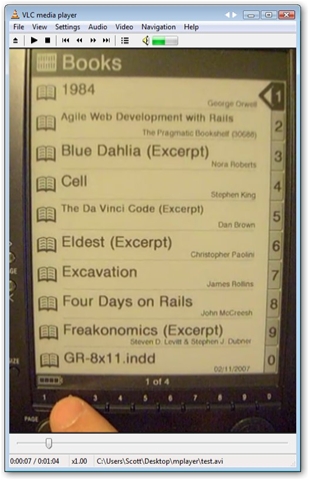
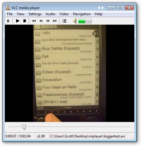
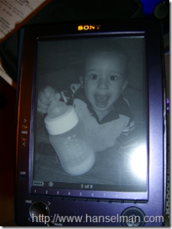 The screen, the screen. It's all about the screen. It's eInk. It's not an LED - that's important to note. It's 170 DPI with four levels of gray, versus 96 DPI (or possibly 120 DPI) on a laptop or PDA screen. The battery is used only to change the configuration of the screen i.e. you only use power when turning the page.
 - The screen has a refresh of about 1000ms, and rarely, but it happens, you'll see a ghost of the previous screen because the "turn" didn't completely "take." However, when it's not turning, it's amazing. It really is. It's TOTALLY comfortable to read. I have read a 600 page book on it and it didn't hurt my eyes.
- You can apparently read RSS feeds on it as well, downloadable via USB. Interestingly, RSS might be the killer app for this Reader, rather than books.
- Yep, it was too good to be true. Instead of being able to subscribe to any RSS feed, you're only allowed to subscribe to the 12 blogs they've got partnerships with, so basically Slate, Engadget, the usual suspect. Wow. That's so lame it's really hard to express.
- It also has volume buttons and headphones so you can use it as an audiobook reader or MP3 Player. This also allows you to read while listening to background music.
- This seems like a good idea, and the audio on this thing is garbage. It doesn't support Audible (which Rocks by itself, by the way) and playing MP3's has a hiss in the background. Why bother I say.
- The guy at Borders said they haven't had to change the batteries on the demo model ever. They say 7500 page turns on a single battery.
- If you're not playing music the battery life is obscene. I'm going to take it on a week-long trip and see if it'll last the whole time. I suspect it will.
- There's 3 font sizes...each is comfortable, even the smallest, but I'm a big font guy so I think I'd have trouble committing to a size.
- I'm still having trouble committing to a font size. I feel like I'm reading a children's book when the font size is so big, but when the font is big, it's very comfortable. I'm mostly using the small size which is comparable to a regular paperback's font.
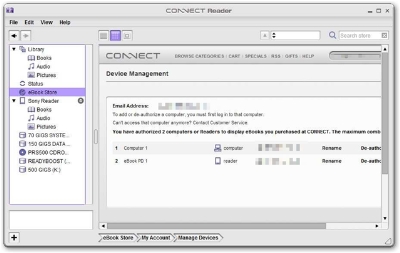 Here's the saddest part. The Desktop Connect Reader software is so profoundly bad, so poorly designed, so truly evil that there are not word to full express the breadth and depths of its unspeakable lameness.
- It tries to be iTunes. I know iTunes. Connect Reader is no iTunes.
- It kind of looks like Windows Executive. Remember that?
- The "browser" area doesn't use a known Browser Renderer (IE, Gecko) but rather some internal Sony Voodoo. What do you care? It's not accessible via the keyboard. That means while you can Tab between Text Fields, you can't access drop downs without the mouse. Yikes. Not only is that jarring as you try to fill a field out, but it makes the process nigh-impossible for non-mouse using folks.
- Drag and drop is partially implemented. Partially meaning I could only get one scenario to work, and that was dragging files from the Library node to the Sony Reader node in the tree. You get a helpful international NO symbol if you try to drag files from your hard drive to the Sony Reader or from the file system to the Pictures or Books nodes.
- Purchased content isn't automatically copied to your Sony Reader, you have to manually drag it, and again, only to a single node in the tree.
- One thing that isn't that bad is the PDF support. You just drag a PDF into the Library node, then AGAIN to the Reader from the Library, and you're set. At least that works. There is rumor that PDFs over 1000 pages have problems, but I personally haven't any to test. Most A4 or 8.5x11" PDFs, however, have very small text on the 6" screen, so you need to either resize the text with a PDF editor, or rotate the Reader's screen and view the pages one-half at a time. It's not ideal, but it's passable. I would expect I'd have to come up with a better resizing strategy...however it's largely dependant on the way the publisher created the eBook.
- For example, I tried to read 37Signals "Getting Real" PDF, a fine book to be sure. However, they encoded it as a paperback sized book living in an 8x11 PDF shell. The book is in bordered areas on the pages. This unfortunate choice in formatting made the book totally unreadable in portrait mode, and kind of small in landscape mode.
- Therefore, since the quality of PDFs out there is also dodgy, I'd have to say that this device and its associated software isn't even clever enough to be a good PDF reader.
Is it worth $300? If you're constantly traveling, always moving and like to bring books with you, possibly. I always want to have 4-5 books with me, and often don't bring them because of space. I ran out of books while in Tanzania recently after only two weeks.
Other than that specific problem - that of space - and the cool factor, are books really that much of a hassle? Maybe large technical books and college textbooks, but I suspect that while University-level books are the right problem to solve, that industry would never give up on their lucrative dead-tree process without a hearty push. If this reader would $150, it'd be a no-brainer, but it's not.
 Now, forgetting about this specific product for a second, let's talk about eInk.
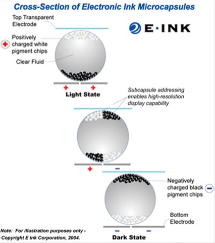
This screen must be wicked expensive because I don't understand why we don't see eInk in more devices.
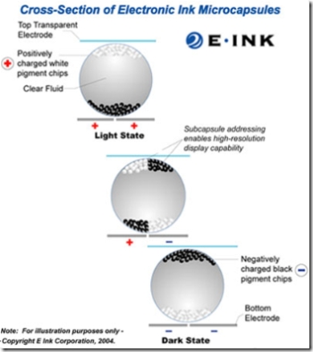
The simplified idea is that you've got a layer of tiny "beads" filled with liquid. In these beads are little color chips of pigment, white and black. The white chips are positively charged, the black ones, negative.
They are inside these capsules that are sandwiched in between two charged transparent plates. The plates are addressable such that each microcapsule can act as a "pixel" or "subpixel" (in two passes) for high resolution display.
It's amazing. The best description of an eInk screen I can give without you actually seeing it is this:
Have you ever been to a furniture store where they have fake plastic computers and TVs on the desks? From far away you think it's real, but by the time you get close, it's clear that the fake image of Word or Excel is printed on the fake computer monitor. It's too crisp, it's got a flat sheen, rather than the gloss of a CRT or the backlight of an LCD. The Sony Reader eInk screen is like that, it's so clear, it looks printed, static, fake.
There's no backlight, it's super-high resolution (you can barely see the pixels, and you REALLY have to want to see them) and it's totally flat. Additionally, the viewing angle is virtually 180 degrees. It's damn-near paper. The only think that's "off" about it is the full second it takes to "turn" the page. Otherwise, eInk is brilliant.
Hosting By


 Big news over here at my company,
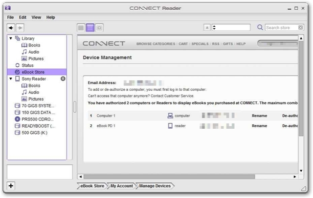