Email Signature Etiquette - Too Much Flair?
The topic came up on a mailing list this morning, when a colleague (whom I respect and am friendly with, to be clear) posted an email where his email signature was, according to Scott Stanfield's measurements, about 810 pixels tall. It is recreated here in a two-page format, because the signature was too long to fit on one page.
I responded, in jest,
Could you speak up? I couldn’t hear you over your email signature…
...and a discussion about Email Signature Etiquette ensued. Adam Cogan has some good suggestions on signatures:
- They should include the phone number – if you want business
- They should *not* have the address/location – rarely needed so find it on the website
- They should have a URL
- They should have a tag line (Scott: I disagree)
- They should *not* have the email address
- I don’t believe in images in footers – although I now have an exception for photos as they make things more personal
- I believe in a tiny bit of corporate colour – for branding purposes
- Your big signature should only be included *once* a thread
Looking back in time through the list server, with Scott Stanfield's help, we see a lot of different email signature styles.
Now, none of these are REALLY obnoxious...Some are classy and understated, with small icons as flair:

Some are a little louder and include a picture of a bull horn and a human ear:
Some are quick minimalist and to the point. Phone, Messenger, Blog. Full stop. I like.

Some use five different fonts and 7 colors, without being too garish:

Some have the audacity to include a picture of the author's huge head and an animation. Apparently you can get banner ad space on the forehead for a price.
Some have logos and certifications as pictures...

Others include everything there is to know about that person, including a quote from Einstein.
After we teased him, Joel went minimalist, and it was good.

The he went more minimalist...

Then he, apparently, became a Buddhist, threw out all his worldly possessions and became like Prince, recognizable only as a symbol. ;)
I think a good email signature says what you need it to say without distracting from the message.
As far as the address to my work, my phone number, these are things I'll send them out of band via Plaxo or IM, or whatever. Email is the primary way I start a conversation, and phones, IM, and other things are easily exchanged later, so I don't need them in my sig.
Now, go audit yourself. How long is your signature? Are you including inspirational quotes that might not be germaine to the conversation, or is your address and phone number on 8 lines instead of 2? Maybe we need a Daily WTF for Email Signatures?
If you have some REALLY obnoxious signature examples, post them on flickr, or on your site, link to them in HTML in the comments, or link back to this post.
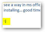
UPDATE: I've since changed my mind and I'm against pics in signatures. I just have two dashes, then my name and domain. Like this:
--
Scott Hanselman http://hanselman.com
About Scott
Scott Hanselman is a former professor, former Chief Architect in finance, now speaker, consultant, father, diabetic, and Microsoft employee. He is a failed stand-up comic, a cornrower, and a book author.
About Newsletter


 Breaking apart content into multiple delivery channels at different hosts helps to offset the cost to host the content. Right now the
  When the Library at Alexandria was at its peak,
  The State of Africa


 Here's a